
Hi!
This is just a place where I’ve put some pics, videos, music. Anything I think that was involved during the creation of WILDFLOWERS
April - June 2026 (bloom four)
May 2025 - February 2026 (bloom three)
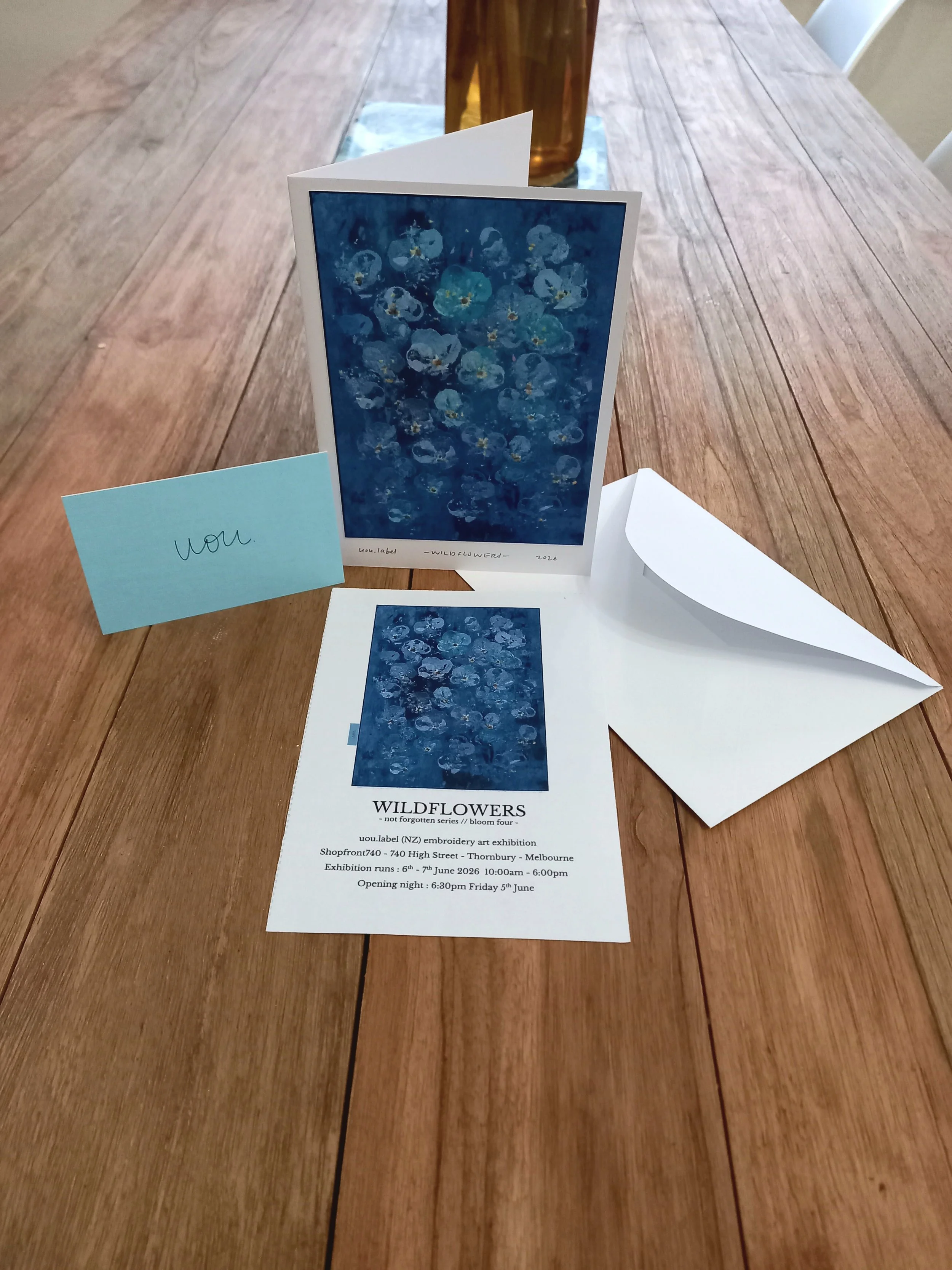
WILDFLOWERS
- not forgotten series // Bloom four -
April - June 2026
After the WILDFLOWERS (bloom three) show with the help of some absolute ledgies we dragged the Embroidery machine home for a month, it was amazing to be almost forced to witness the change of Autumn, which I would usually take for granted but with seeing the trees and plants in the garden change each day over the month it felt more like a lesson in colour.
I lay the bones down on 12 new works and booked a show for Melbourne. With a bit more help I got everything lugged back to the studio for two weeks to quickly finish the works there.
See below a little of what I got upto whilst at home creating works for this exhibition and a little bit of transporting them to Melbourne. spoiler - they survived

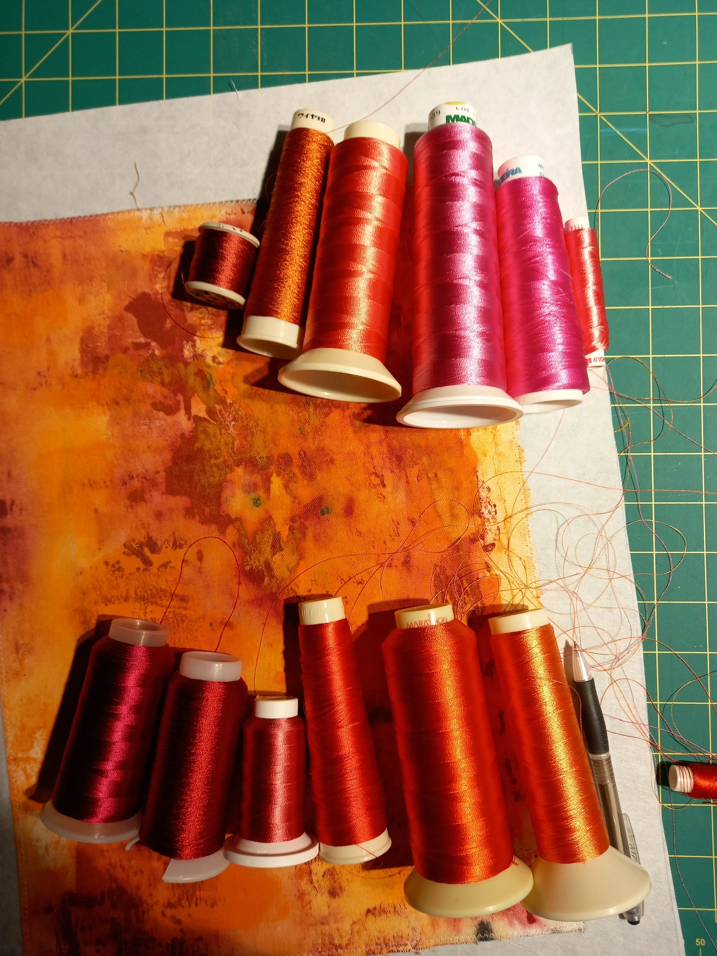
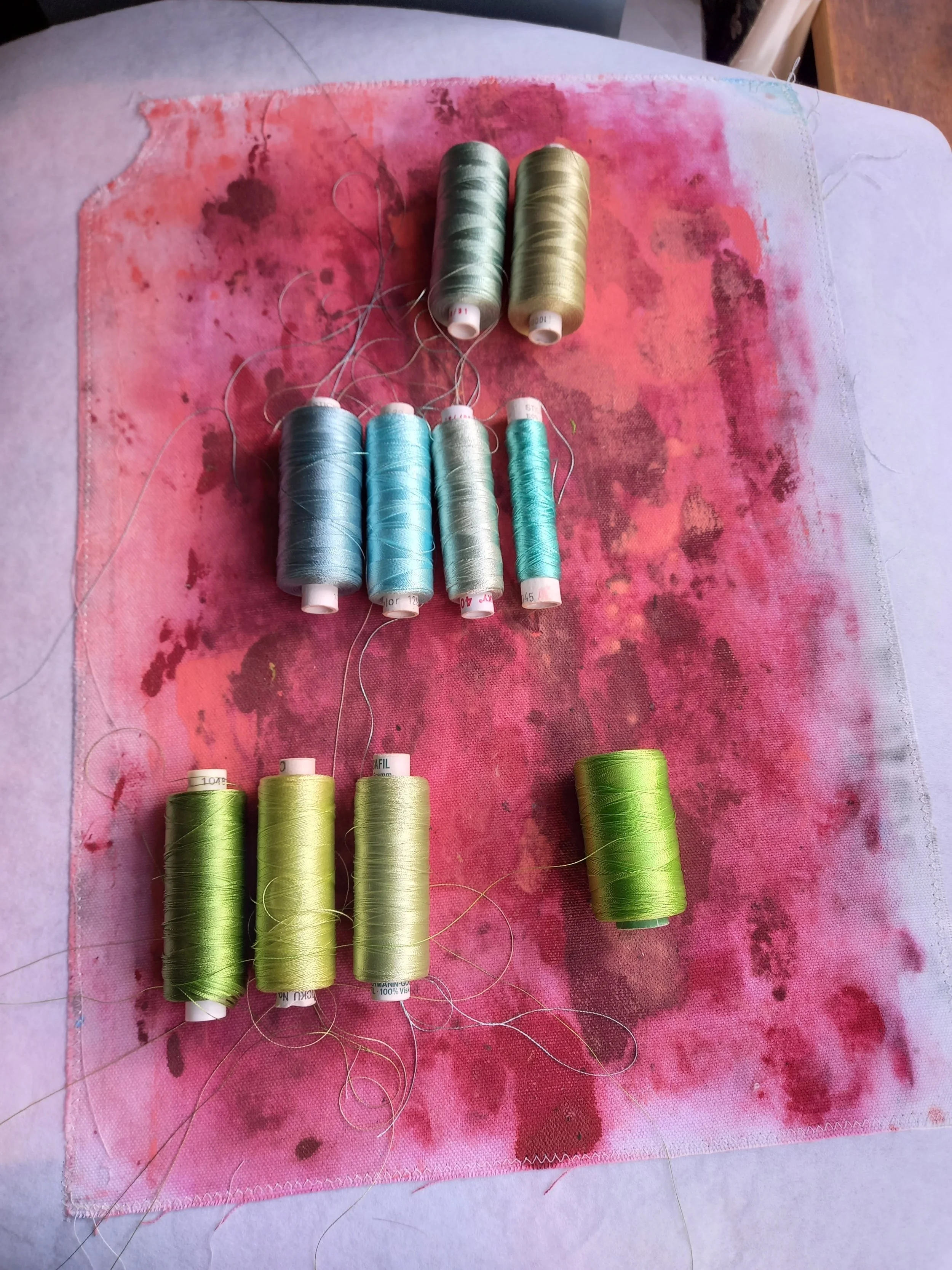
colour selection for "Under the Plum Tree"

That's the backing for Whirlwind, mustve been the initial idea the colours were gonna go in
drying rack. looks like "let them grow" & "just one more day", perhaps the first coat of "Osakazuki"
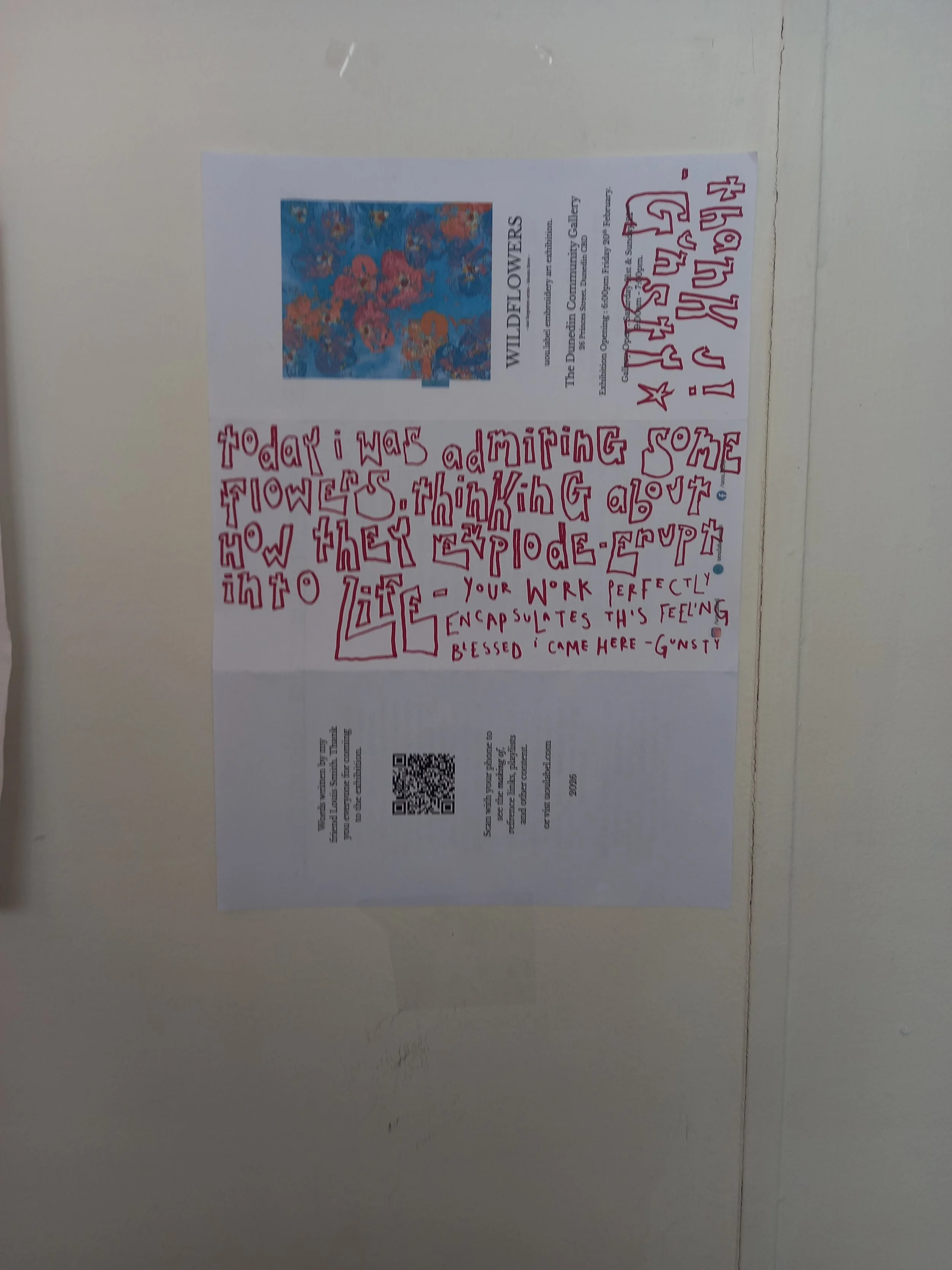
I was handed this by a mysterious Scottish person at the WILDFLOWERS Dunedin exhibition. I love it, it lives in my studio
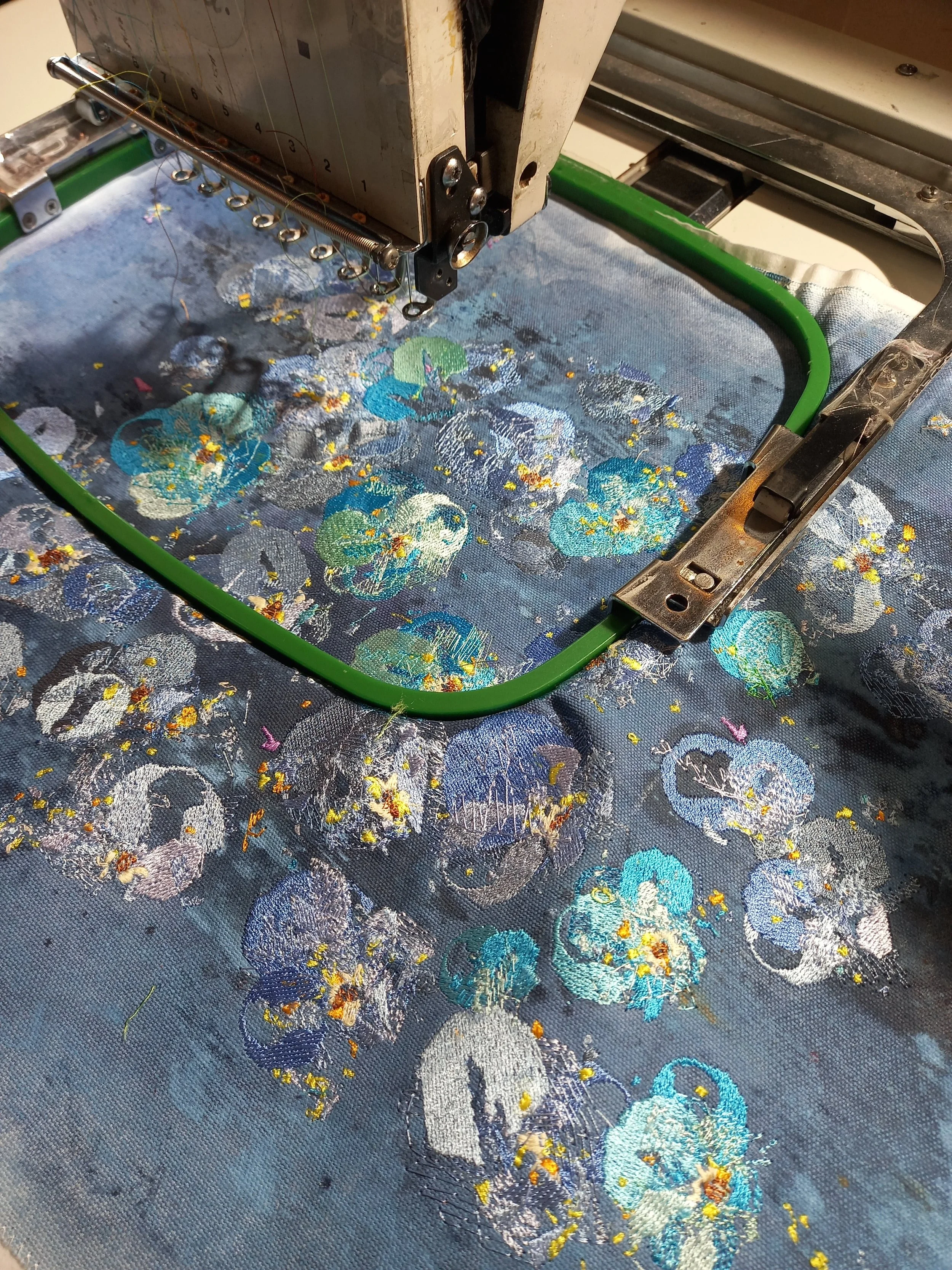
carting the embroidery machine down the stairs at the studio is hard work
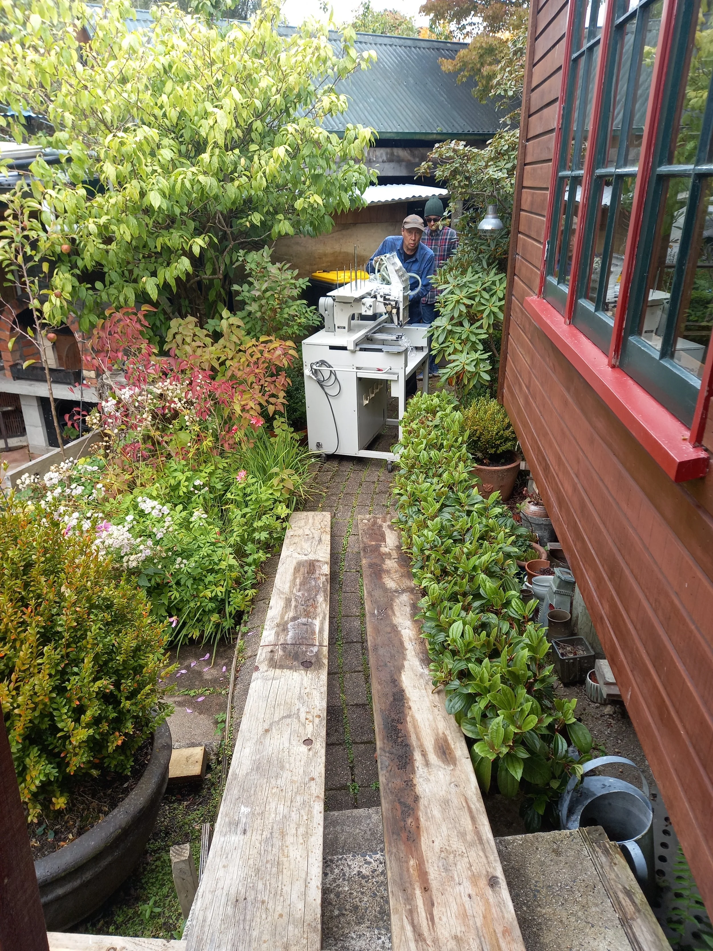
absolute Ledgies
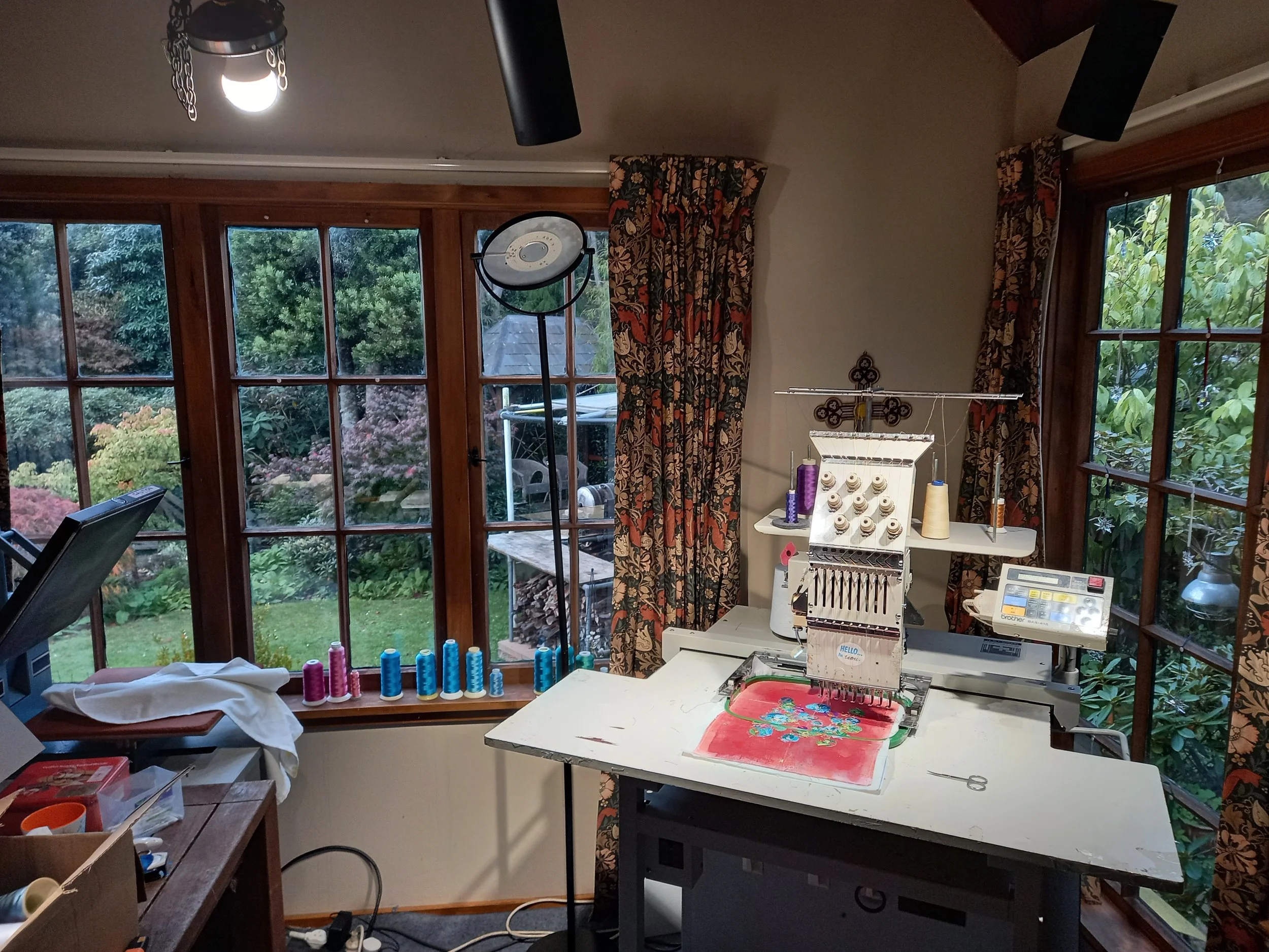
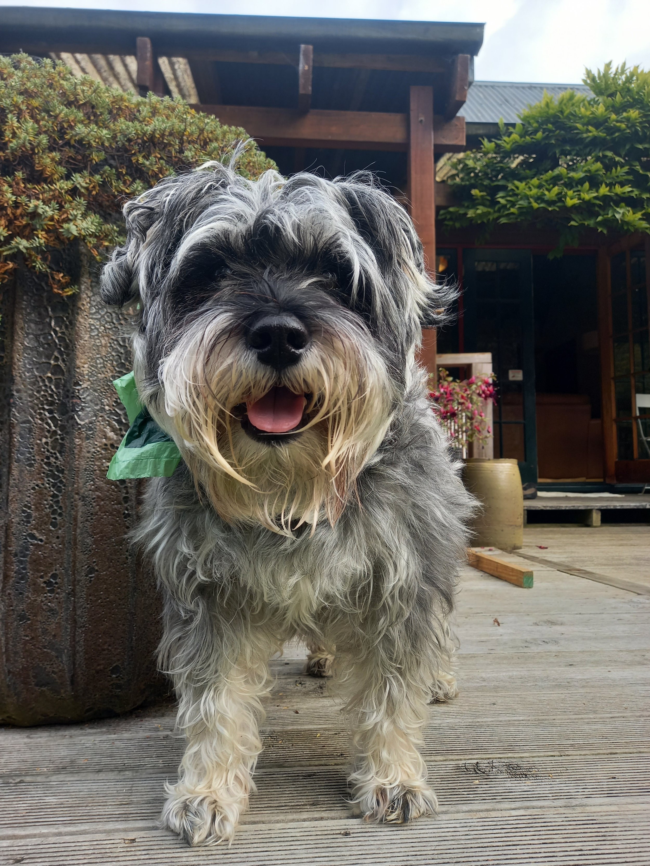
home studio
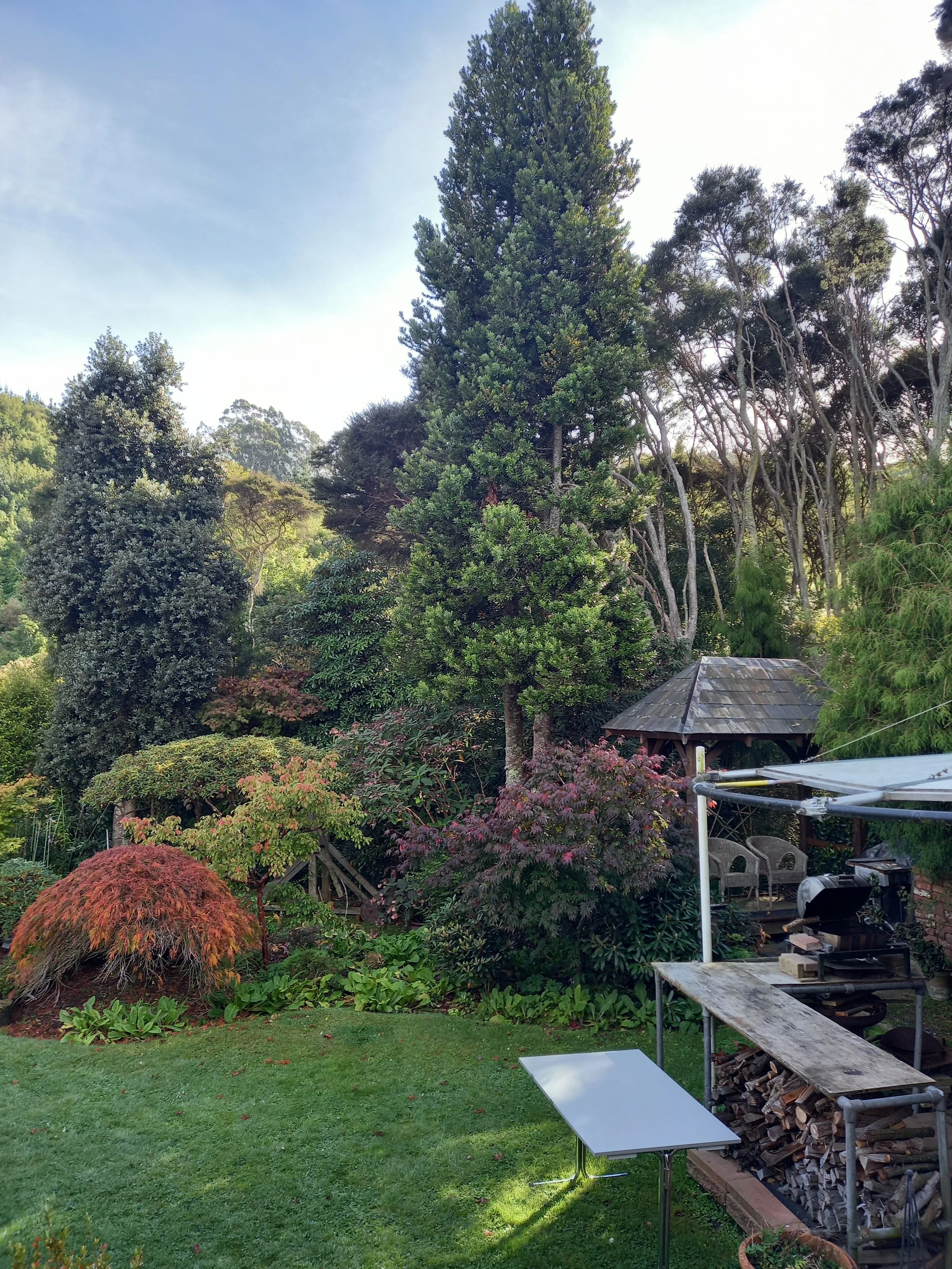
early autumn backyard
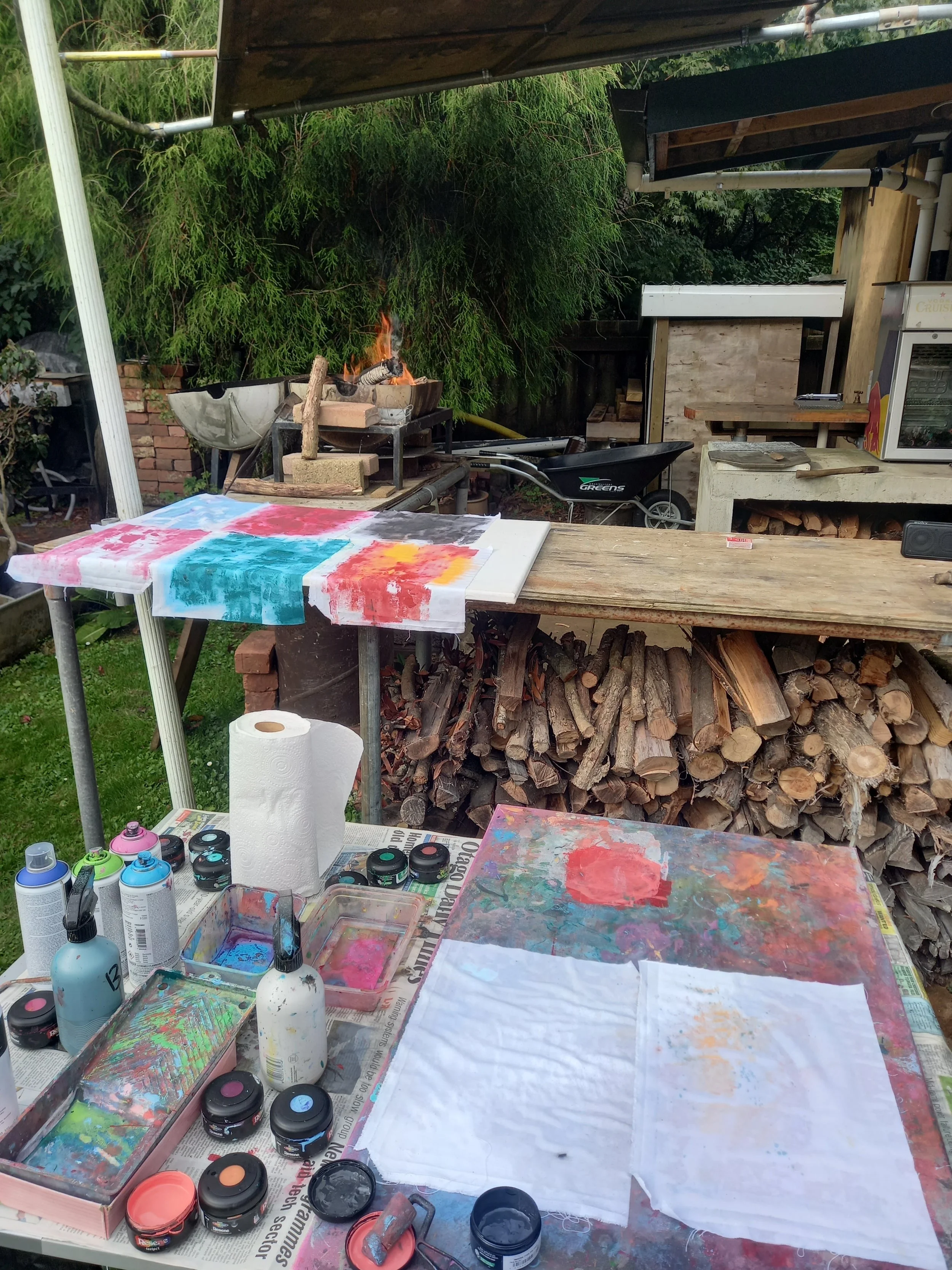
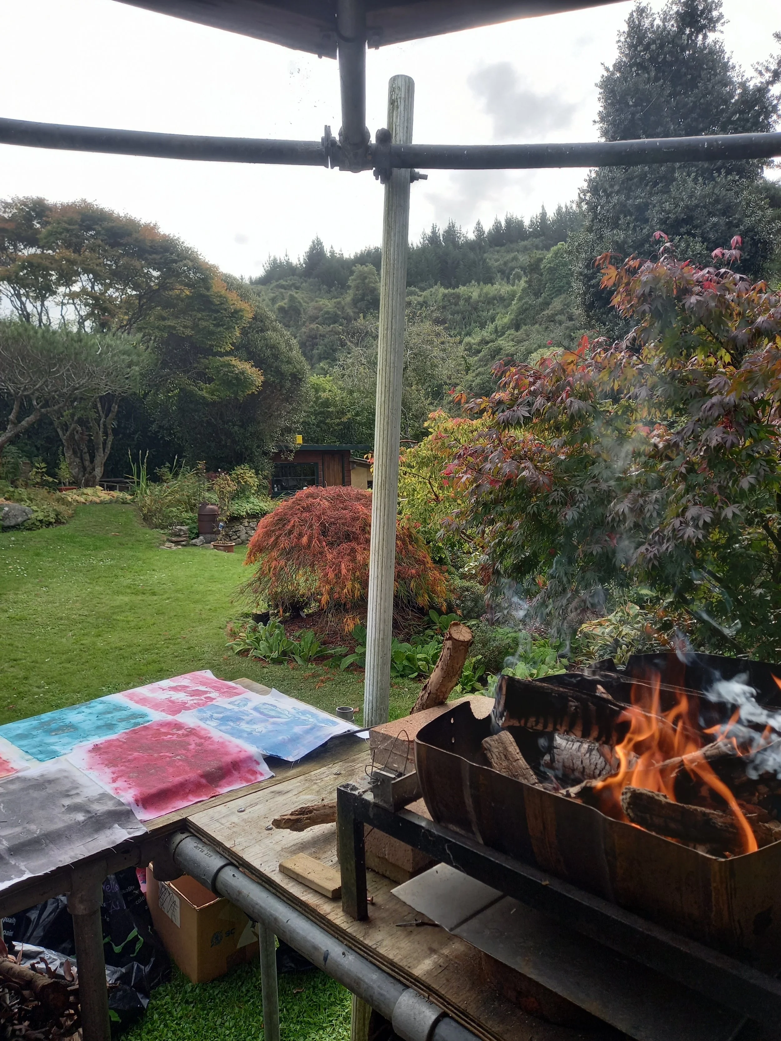
bbqing and painting
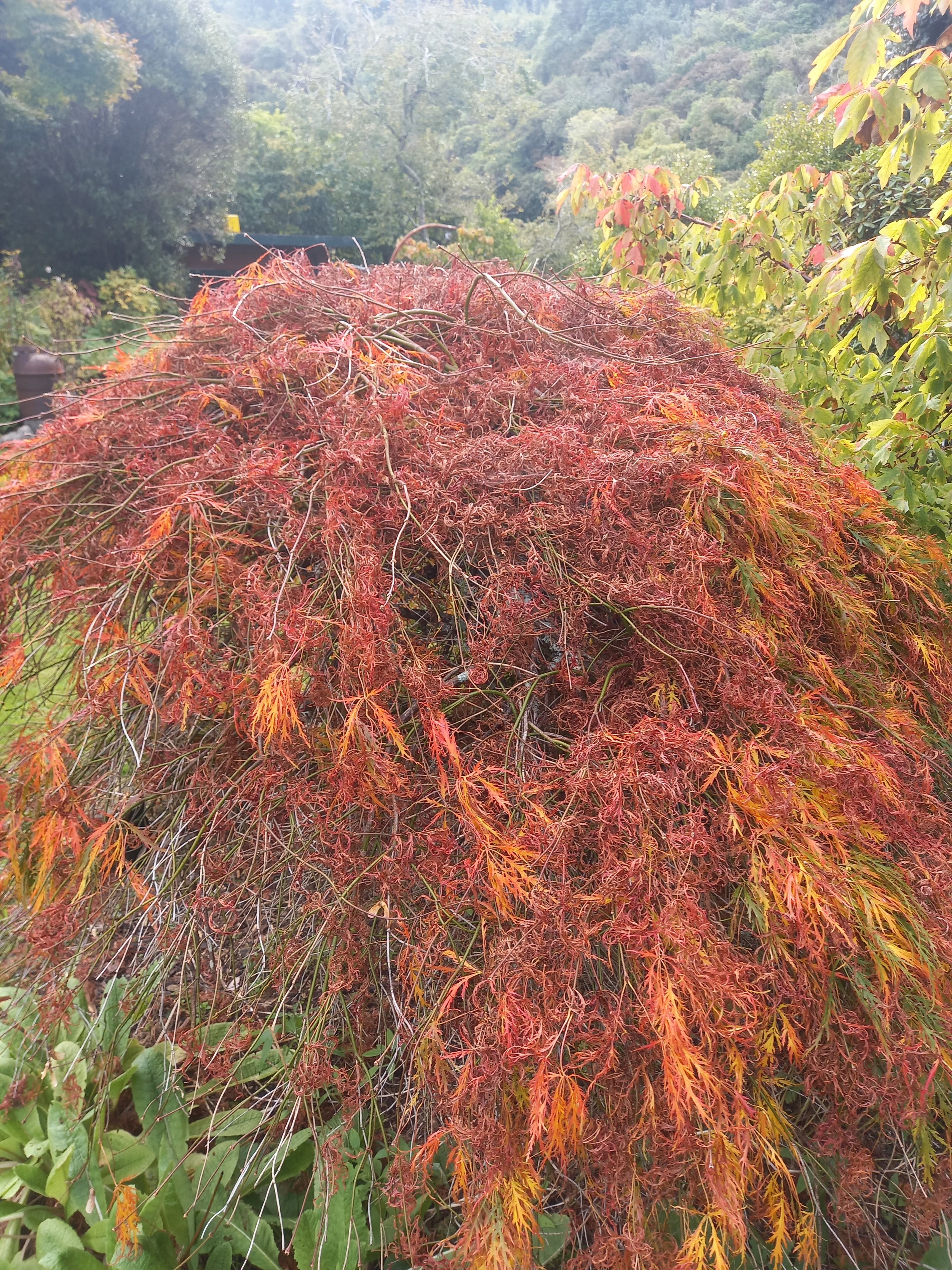
Osakazuki maple - I watched this change every day, it was amazing
"Osakazuki"
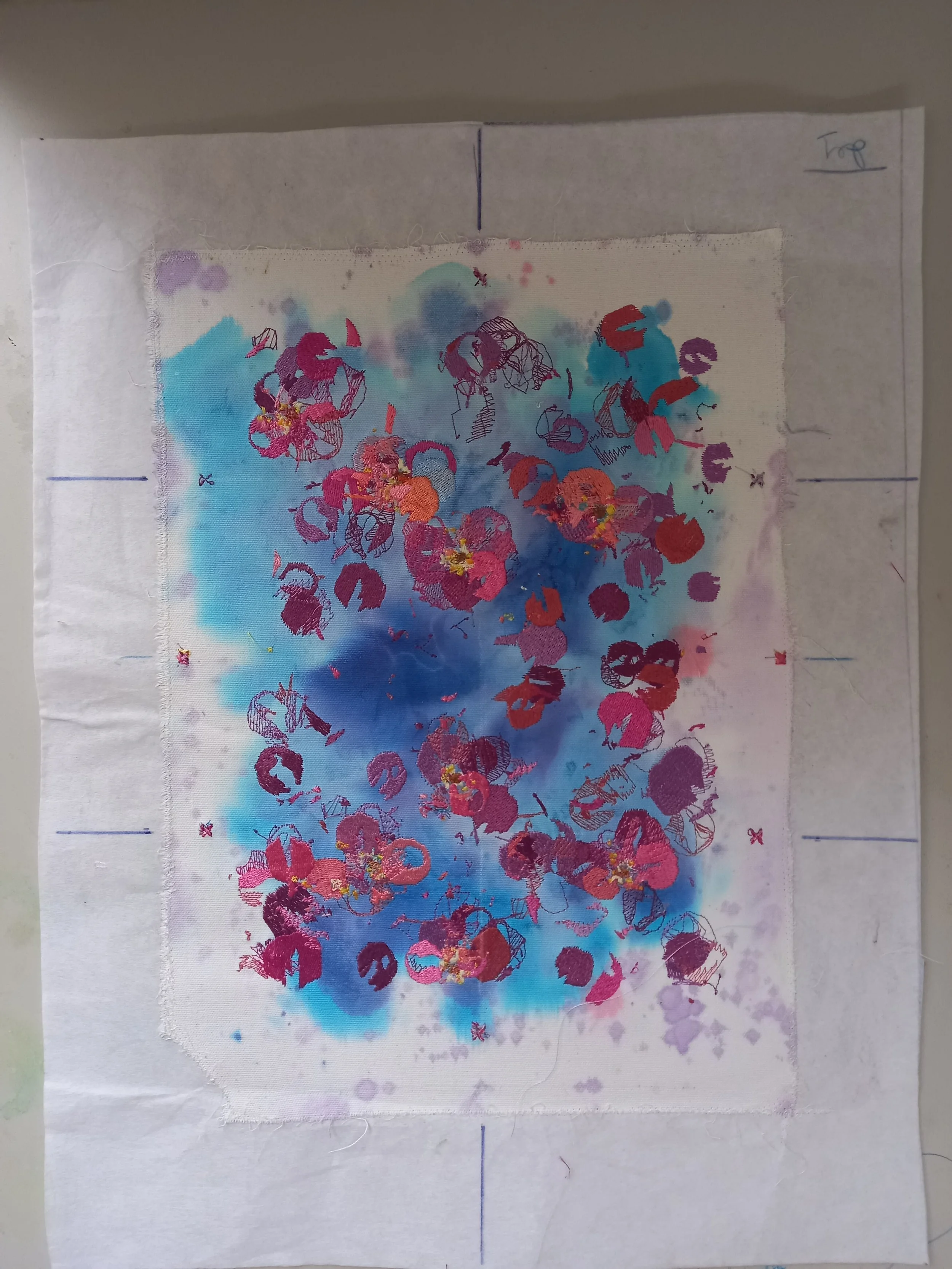
" Midnight Frost "
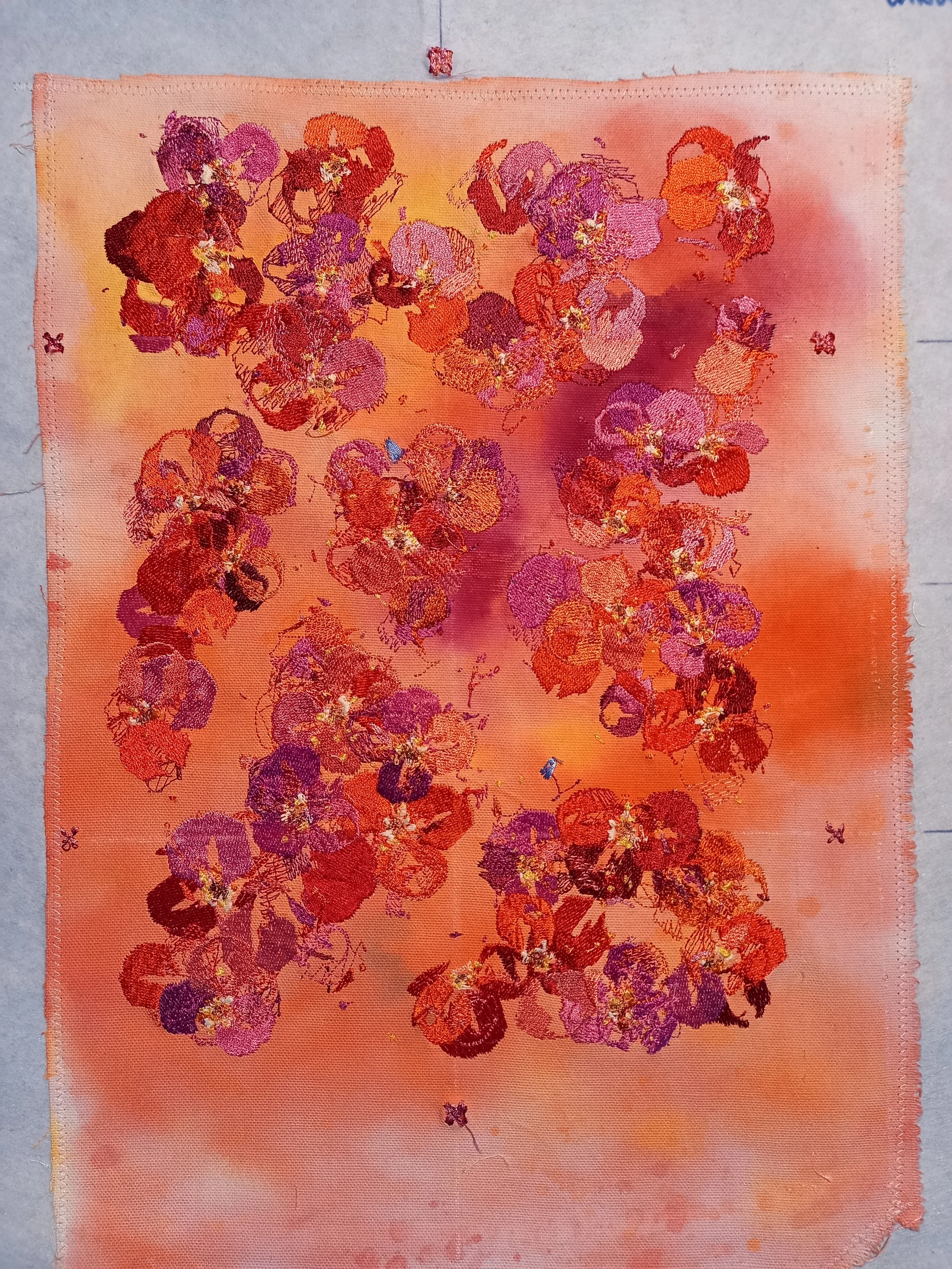
Autumn Morning - the background represents the morning red sky, but i didnt want to call it "Shepard's delight" that colour combo is unhinged
"red lupin sway" - from memory i think i doused the background in green ink? an just left it on the grass while a light drizzle did its thing.
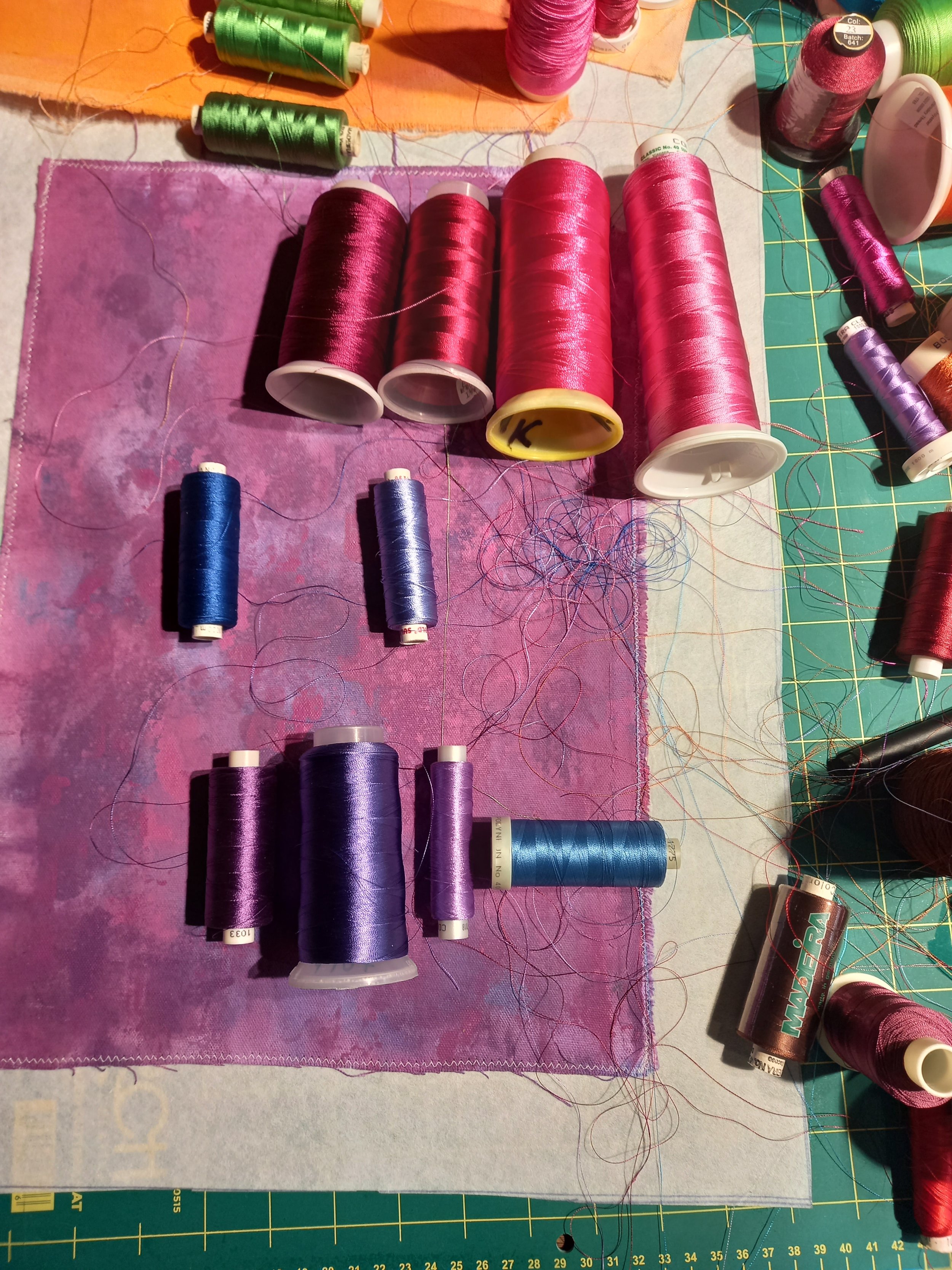
"love letters" trying to figure out once and for all what purple is.. i still dont know.
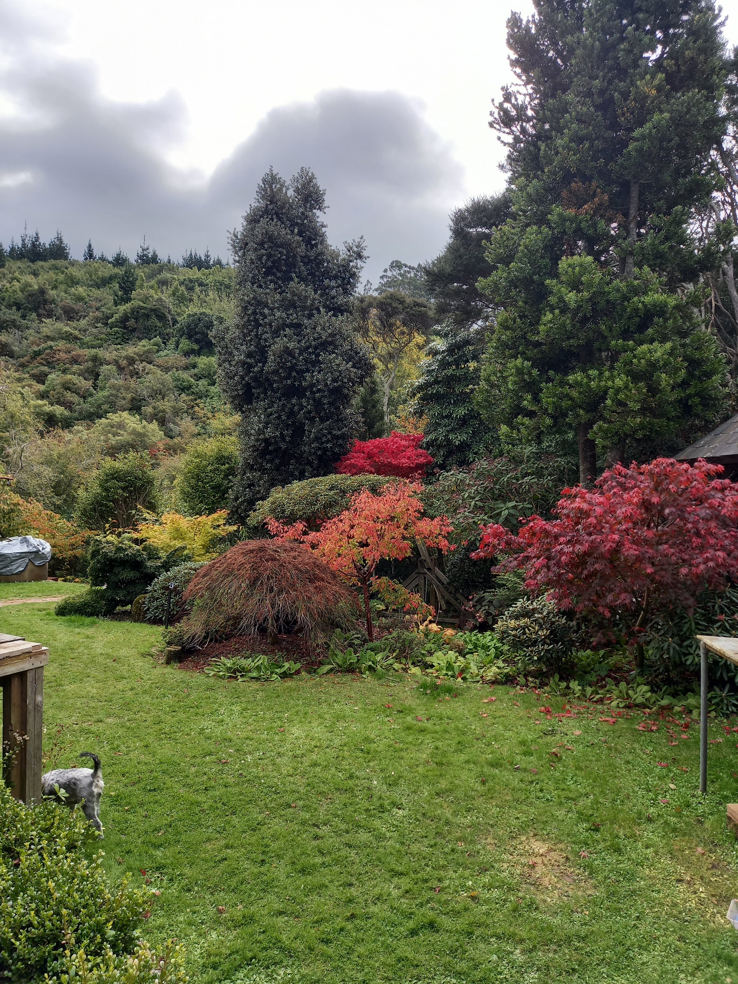
the backyard heavily influenced the backgrounds, not so much the colour of the embroidery.
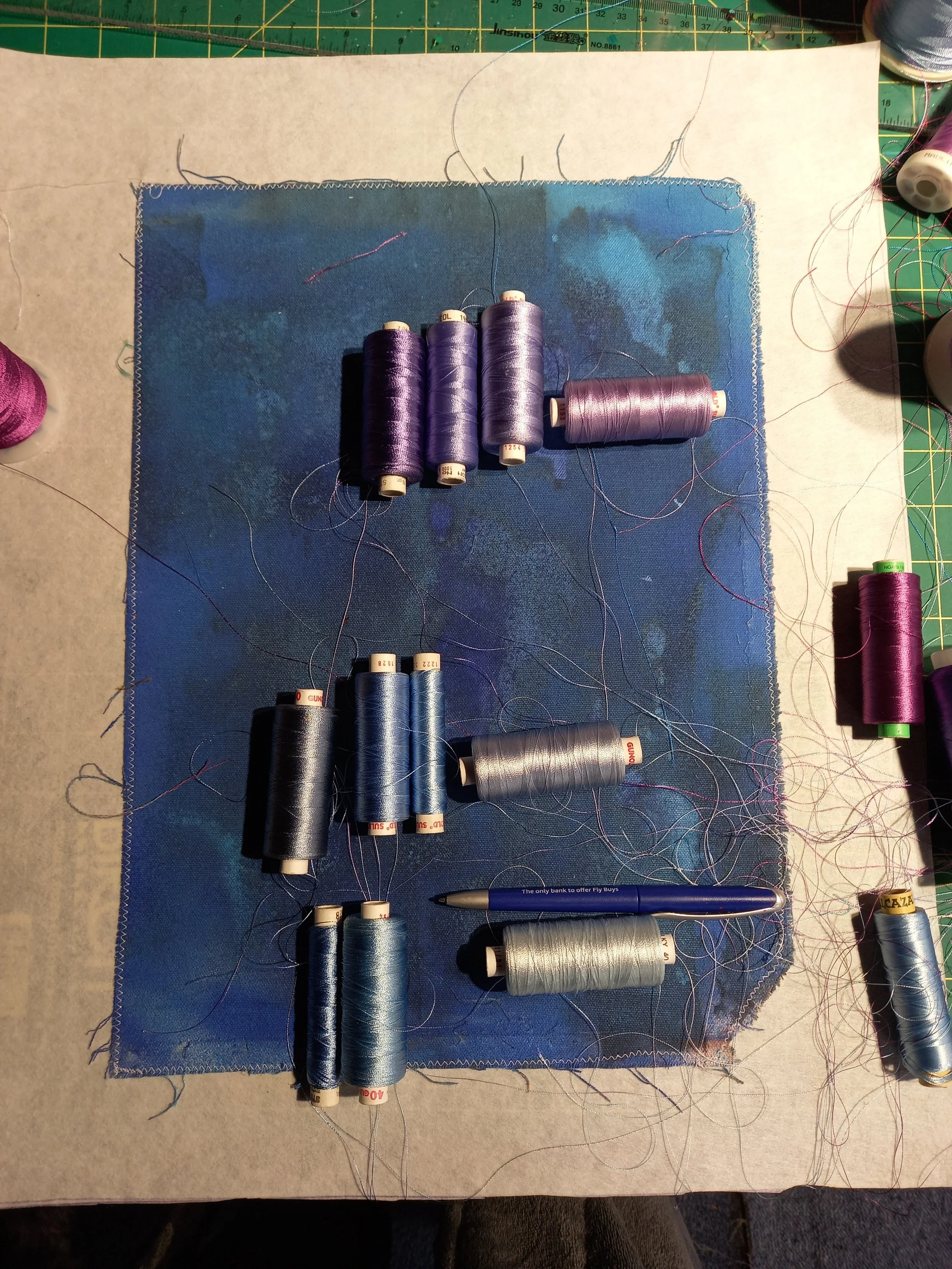
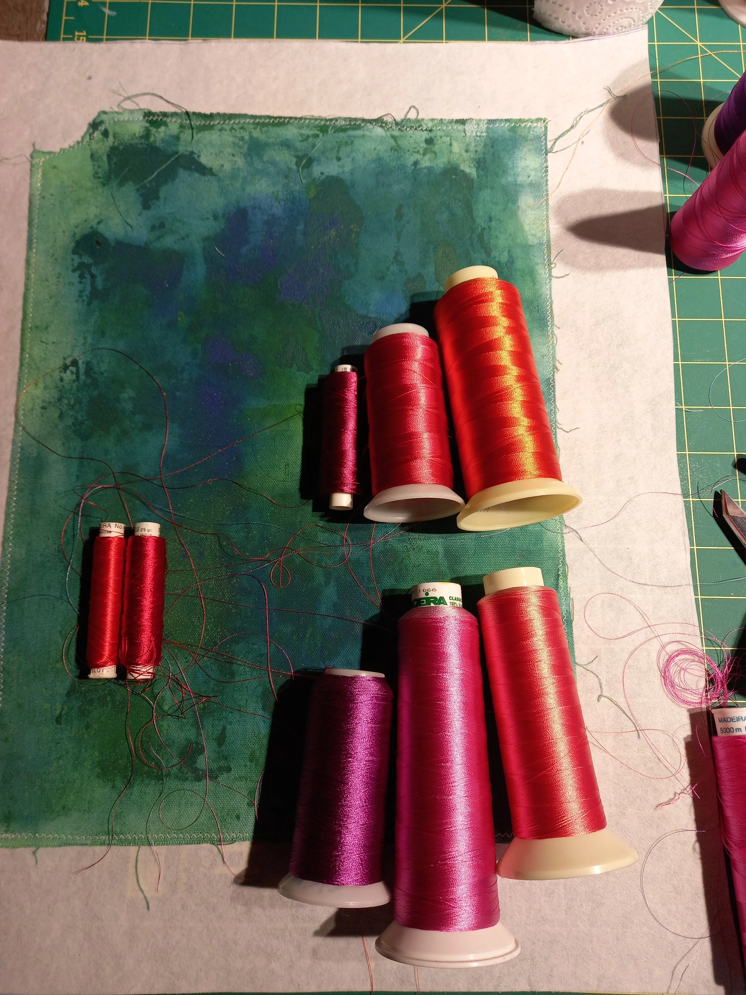
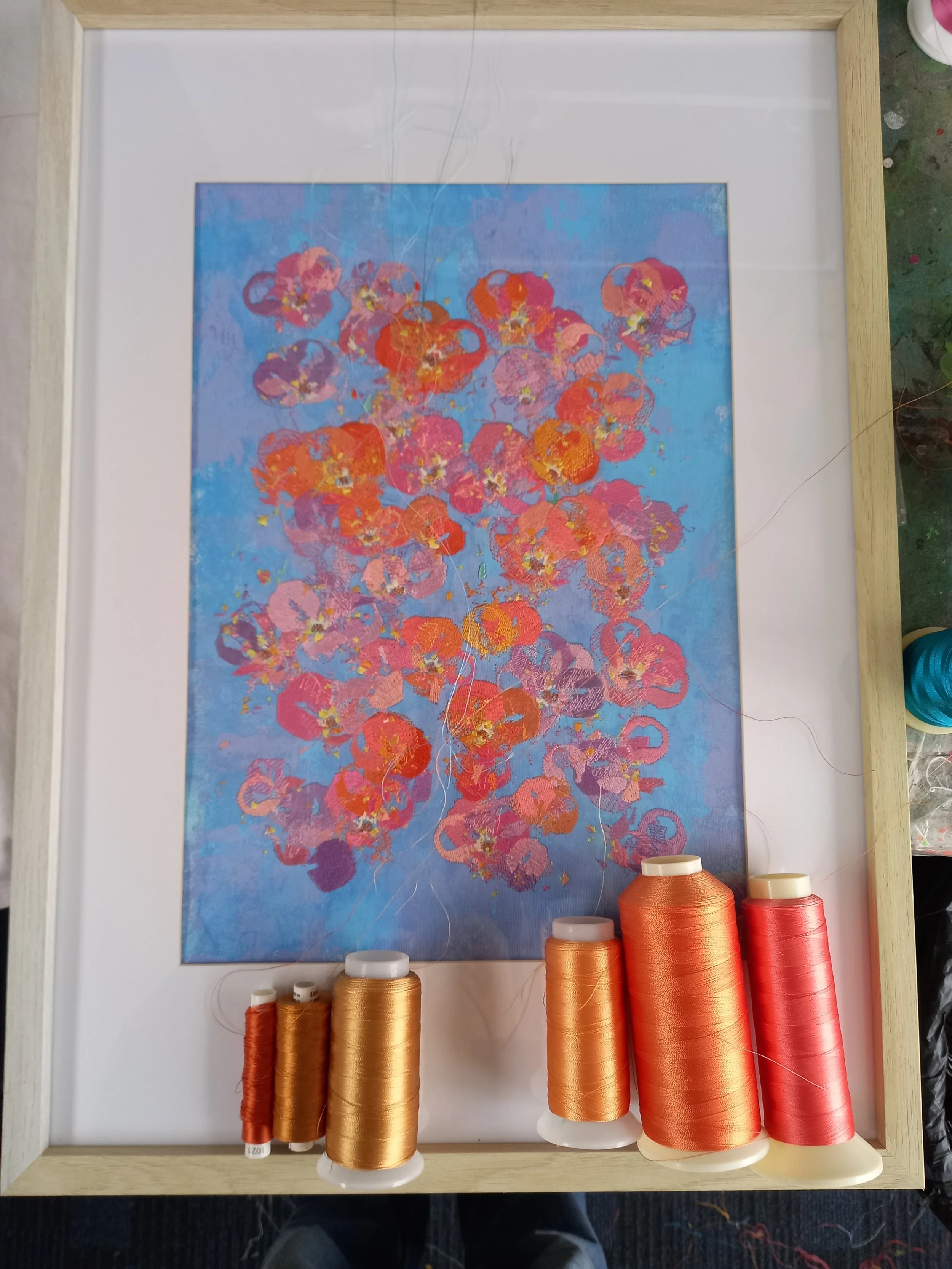
adding a little more green into "Whirlwind" Grey -> blue -> turquoise -> green
thought about bringing rust and brown into "Tulips", but decided to lean more into bright yellows and pinks. its supposed to be a light hearted happy work. - the colours of tulips.

final touches of "Tulips"
handmade cards! party packs
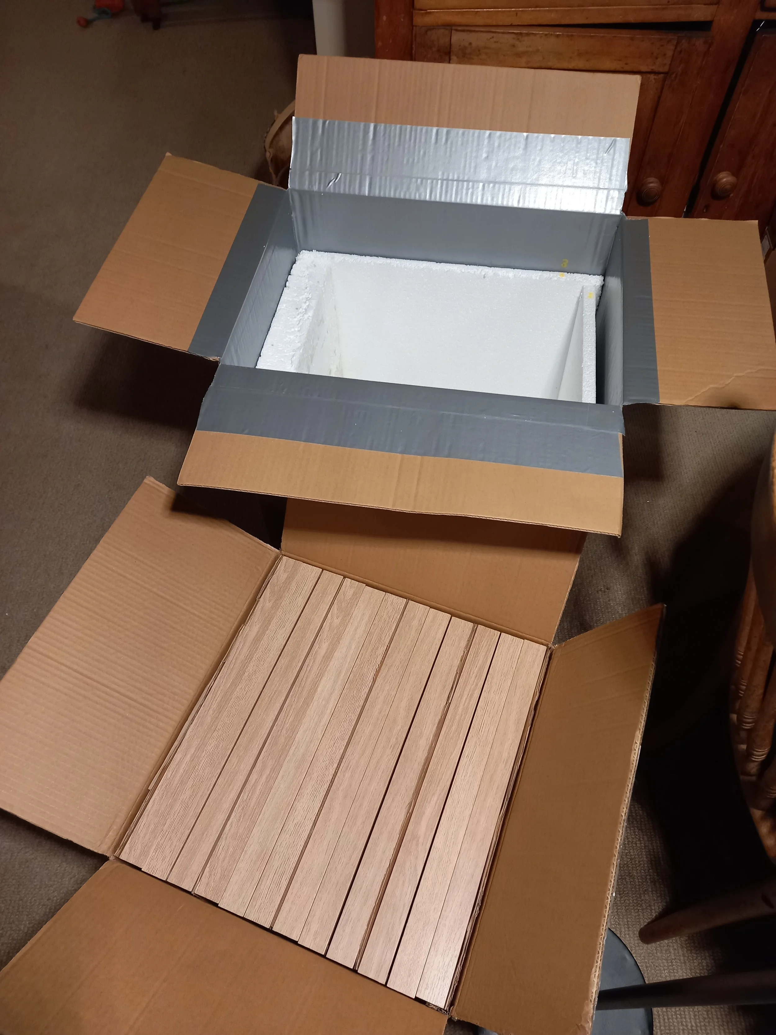
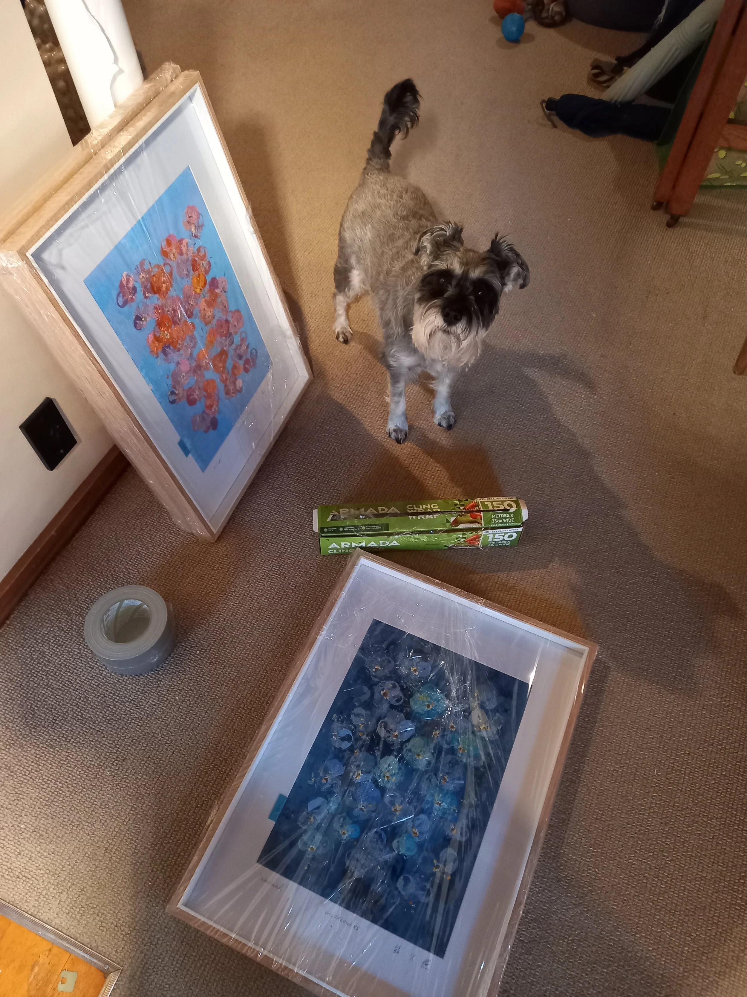
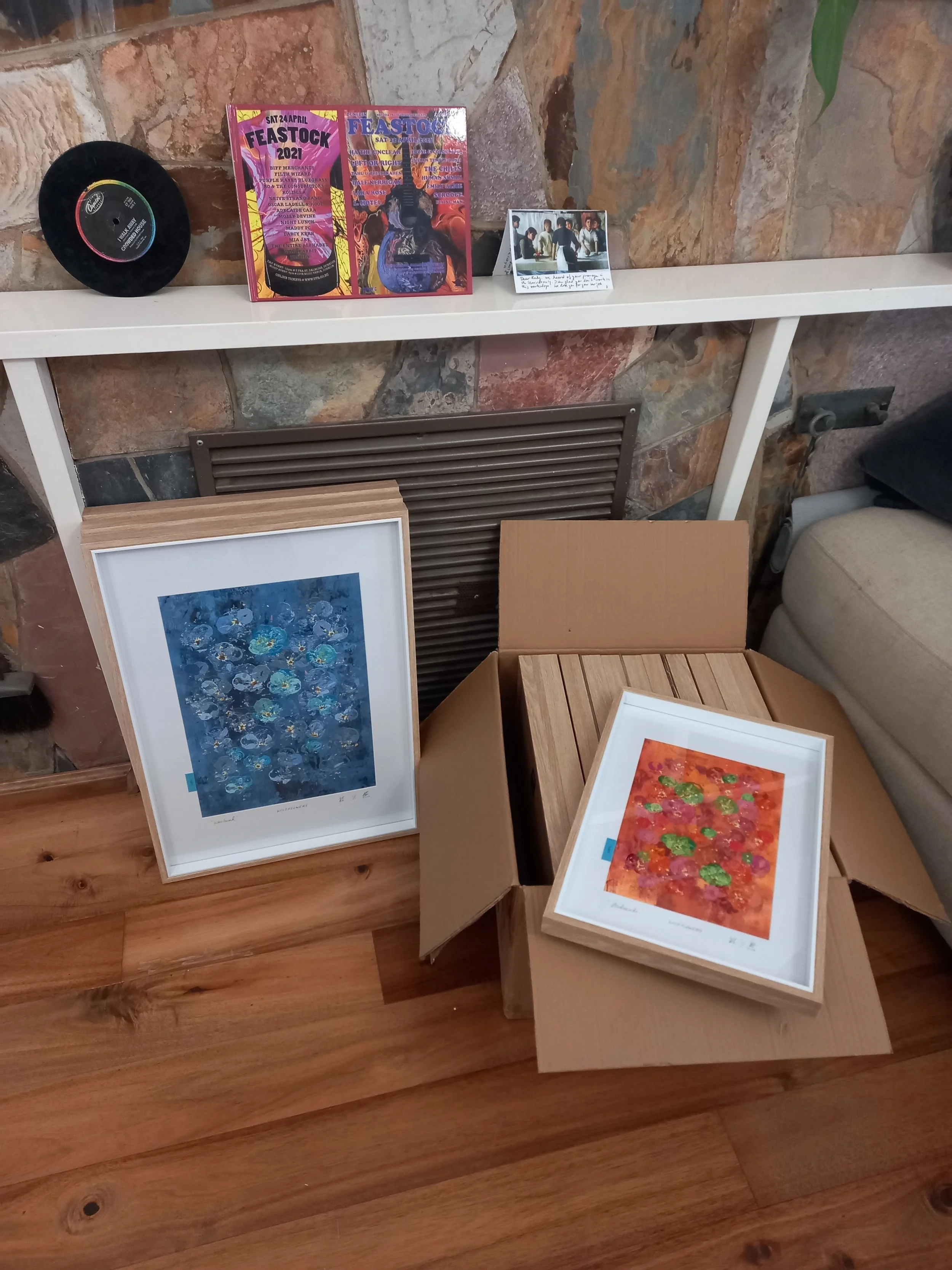
arrived from Dunedin - Melbourne, 2 flights, all safe and sound!
WILDFLOWERS
- not forgotten series // Bloom three -
May 2025 - February 2026
Exhibited at the Dunedin Community Gallery 20th - 22nd February
"Take my hand"
Pushing the pink into red on "Take my hand"
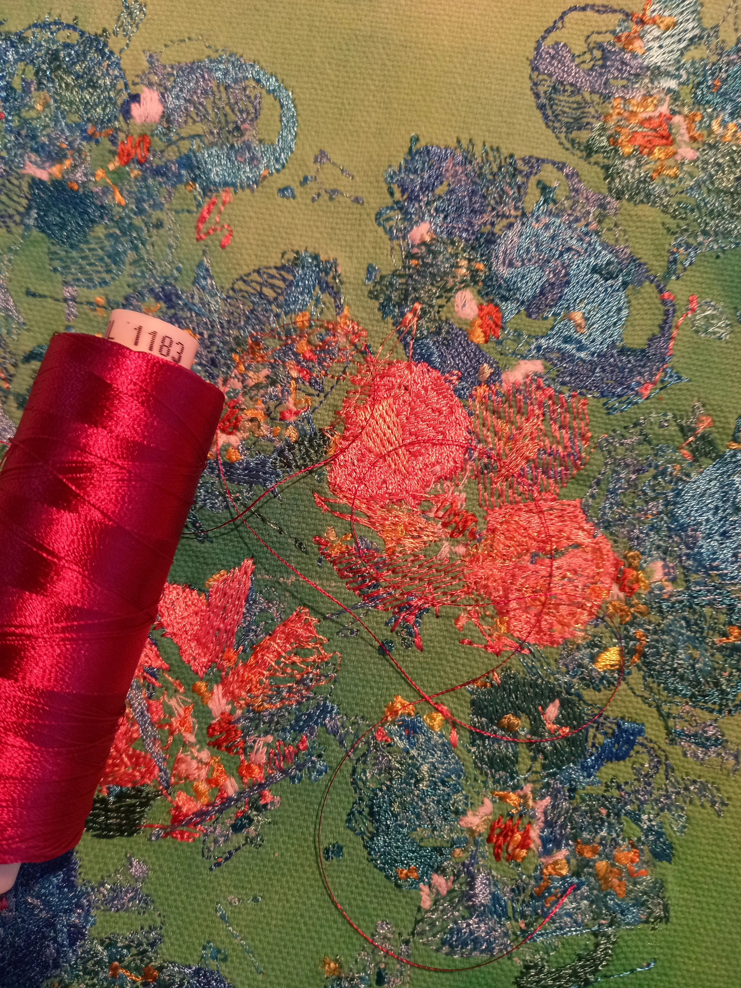
I usually have a small window of where i want the image to sit on the background. kind of depends on playing with density / weight of colour and interaction with the embroidery and background
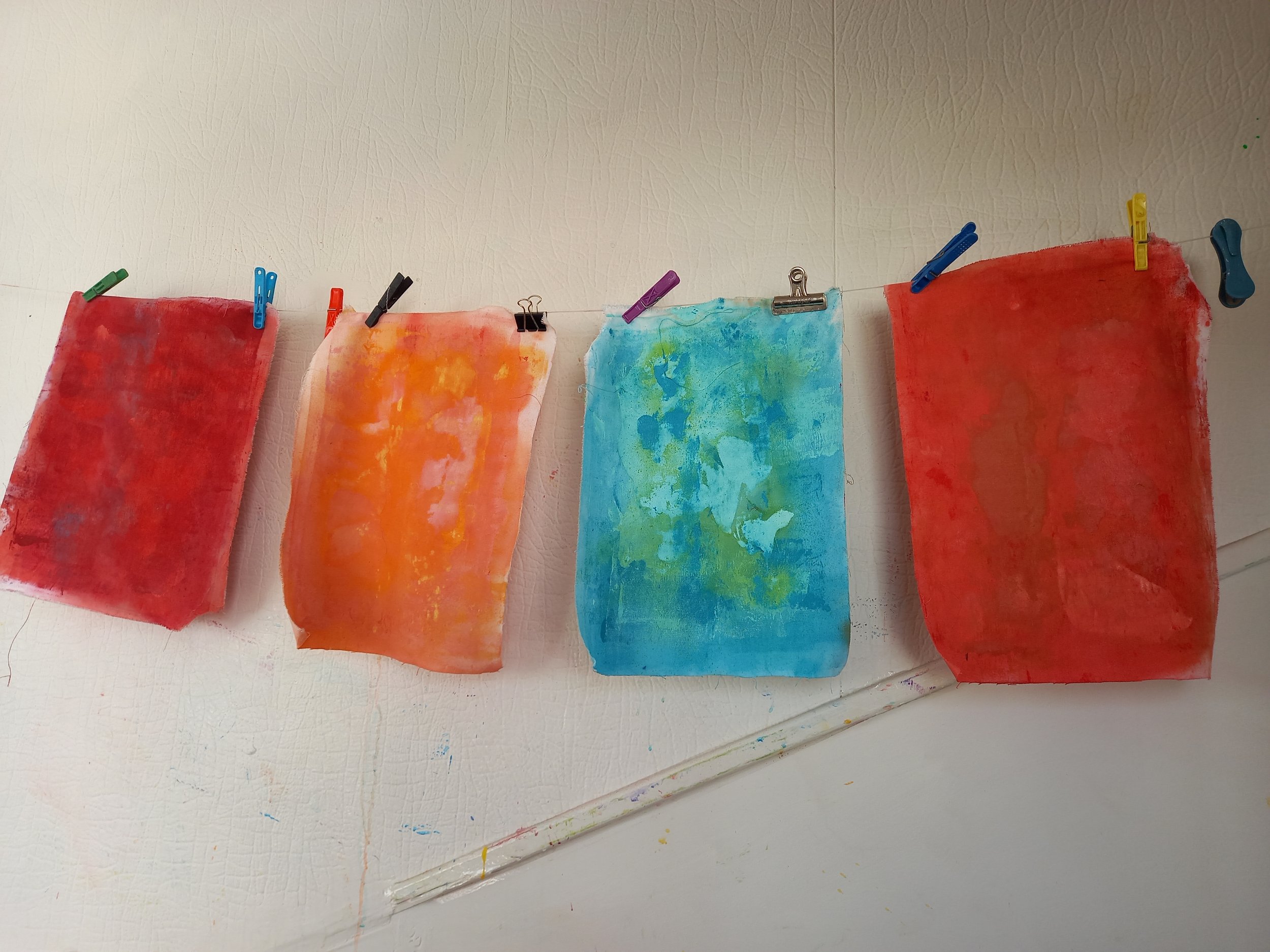
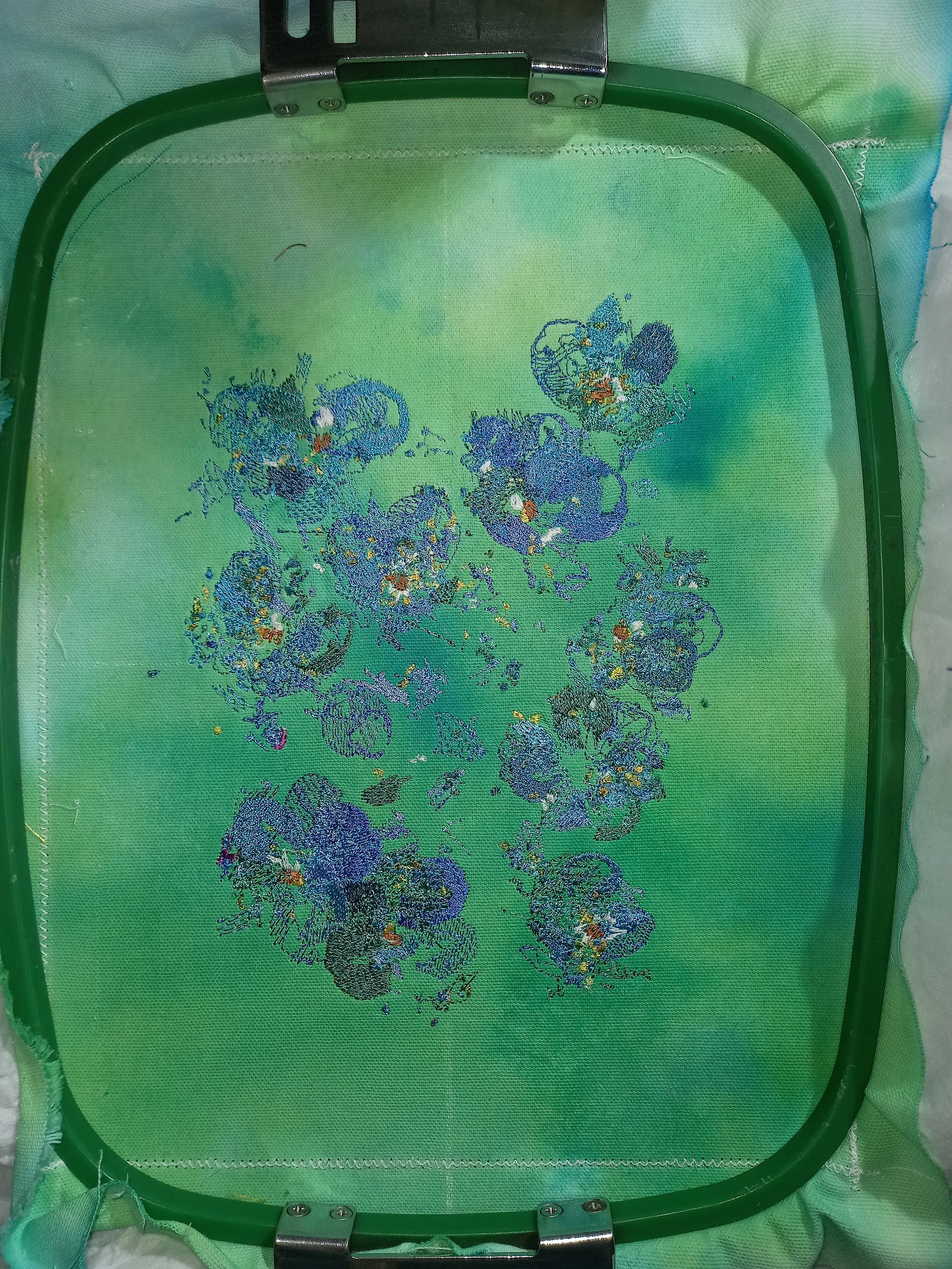
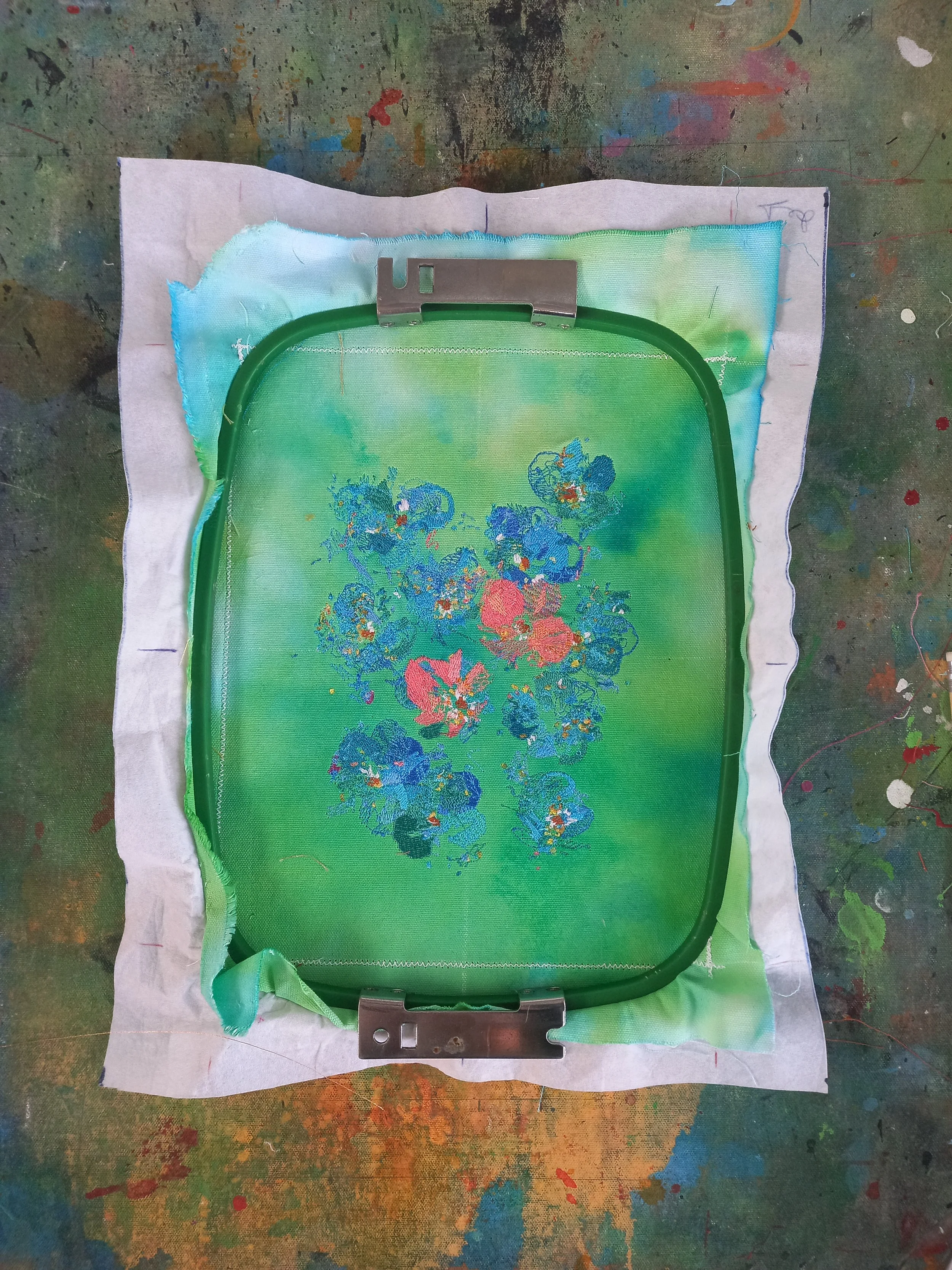
Making " Blueberry "
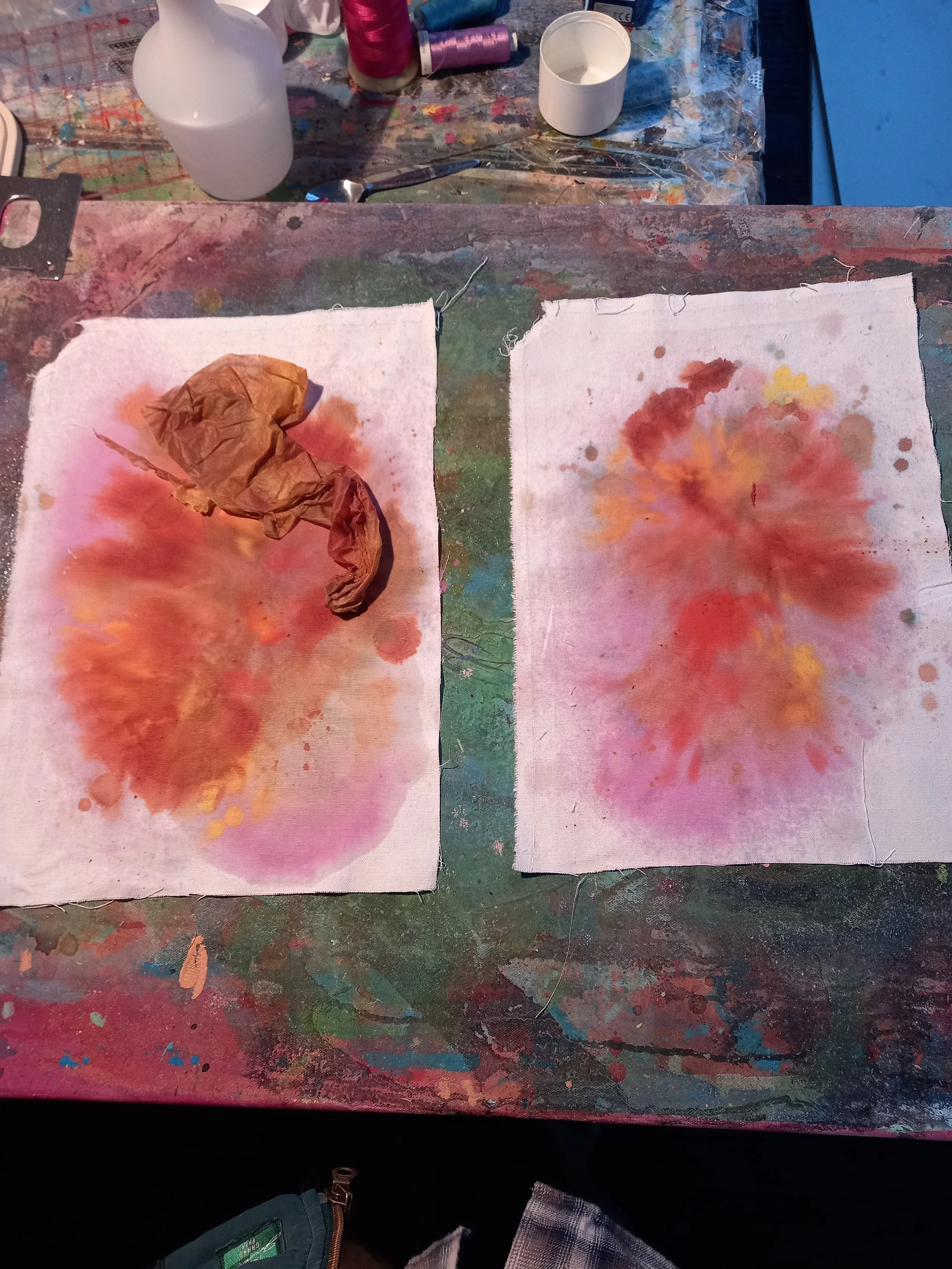
The painting process is always a fun mystery to me.. an then it never comes out the way you expect it when it dry's too. it's addictive
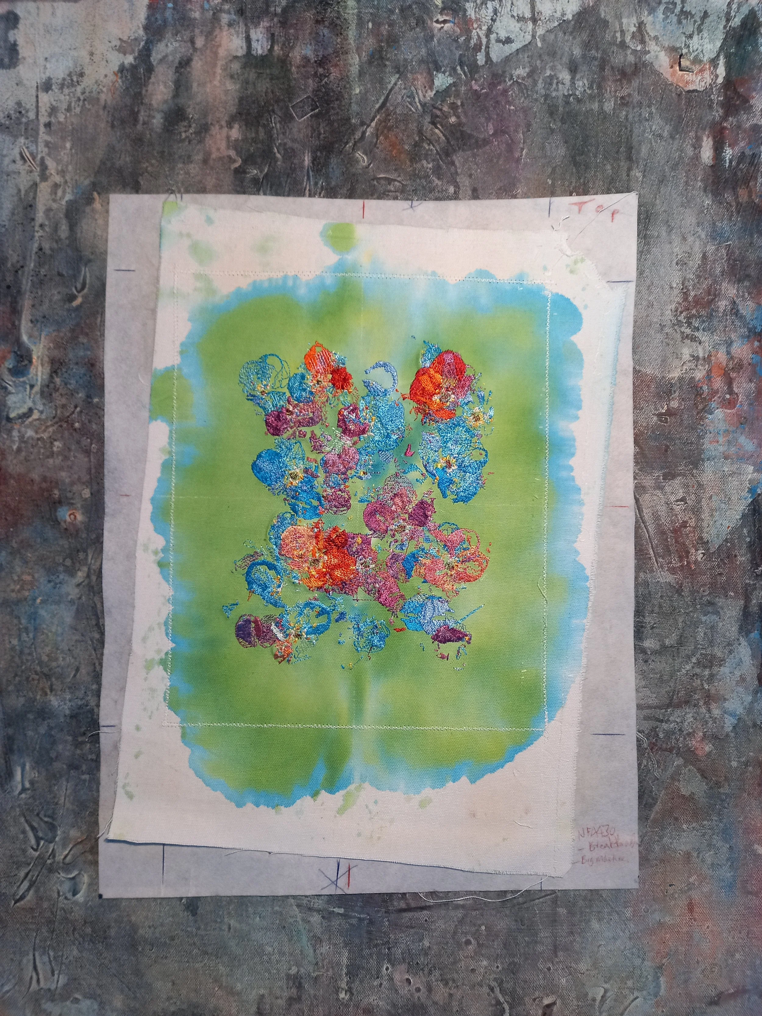
The blue bleeding through the green. a lots often lost behind the white cardboard in the frame. if you have a piece of mine feel free to open it up, plenty of surprises are underneath.
Either morning or evening. who knows, aye. i'm not wrong though haha
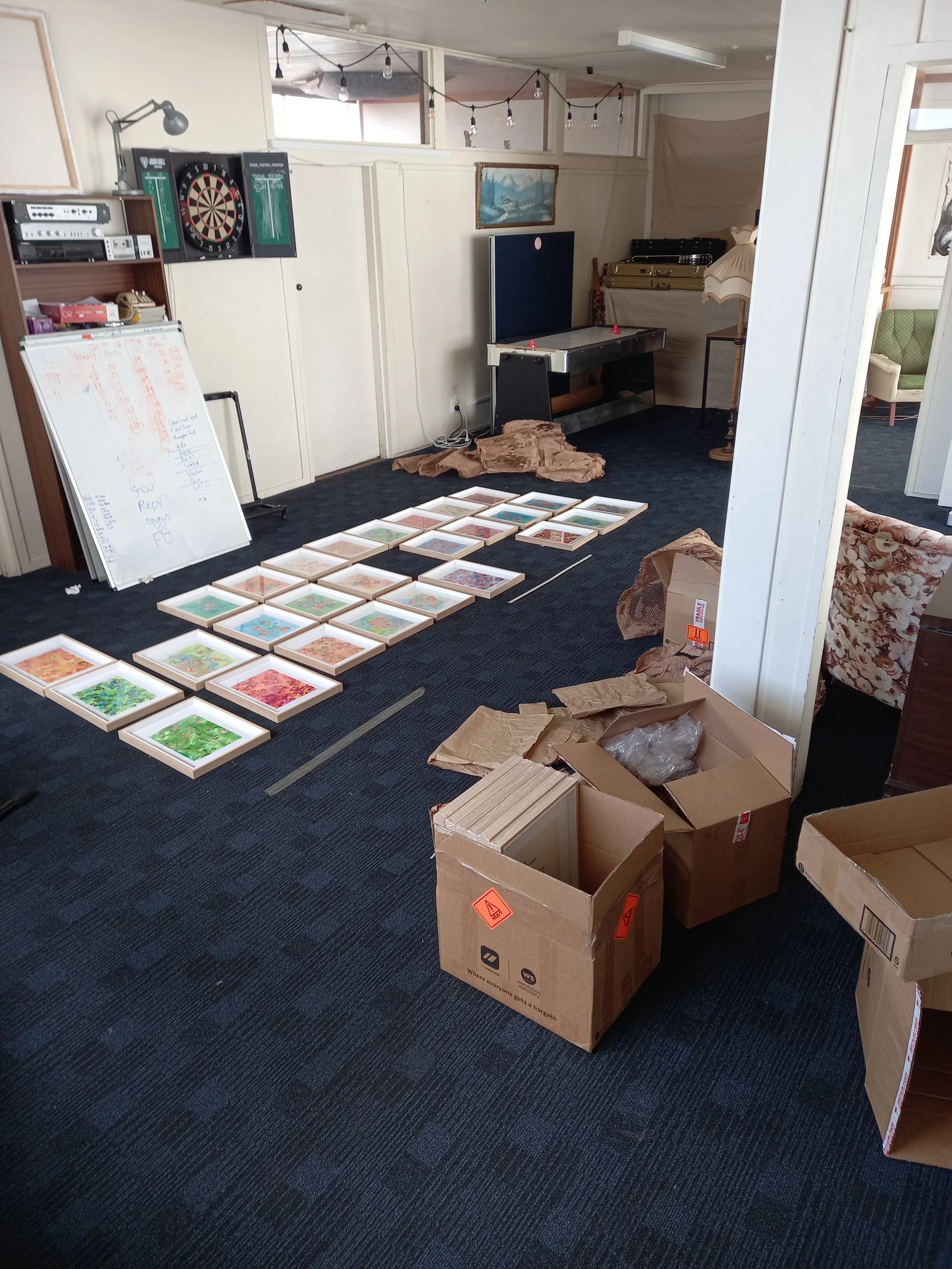
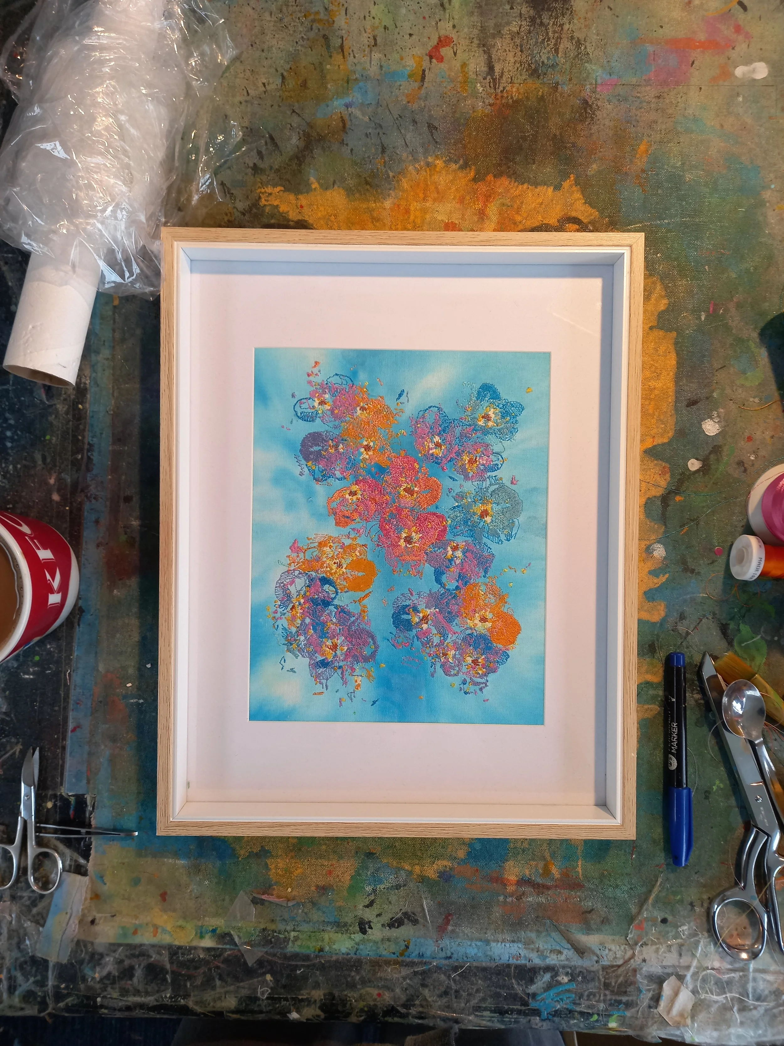
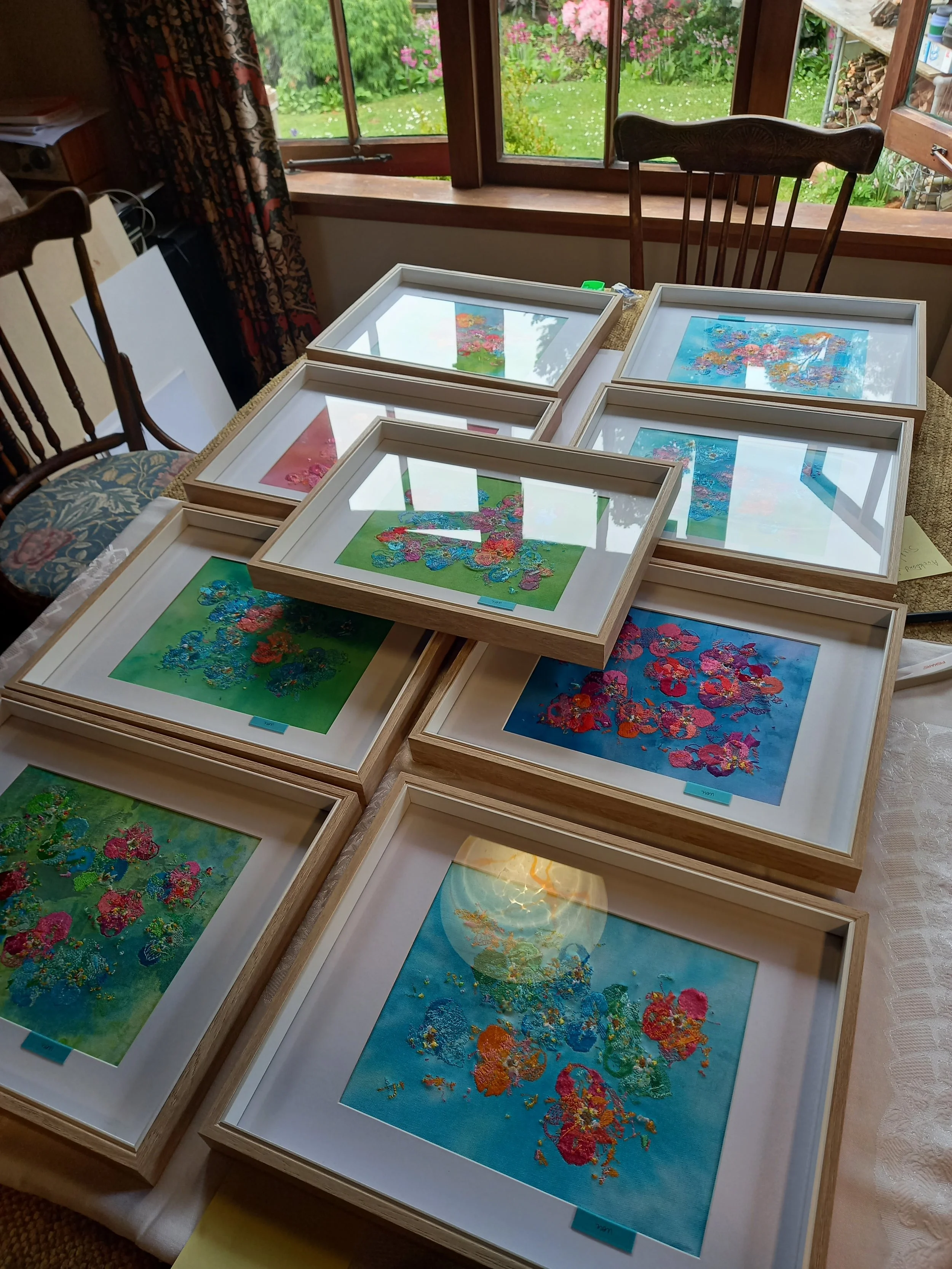
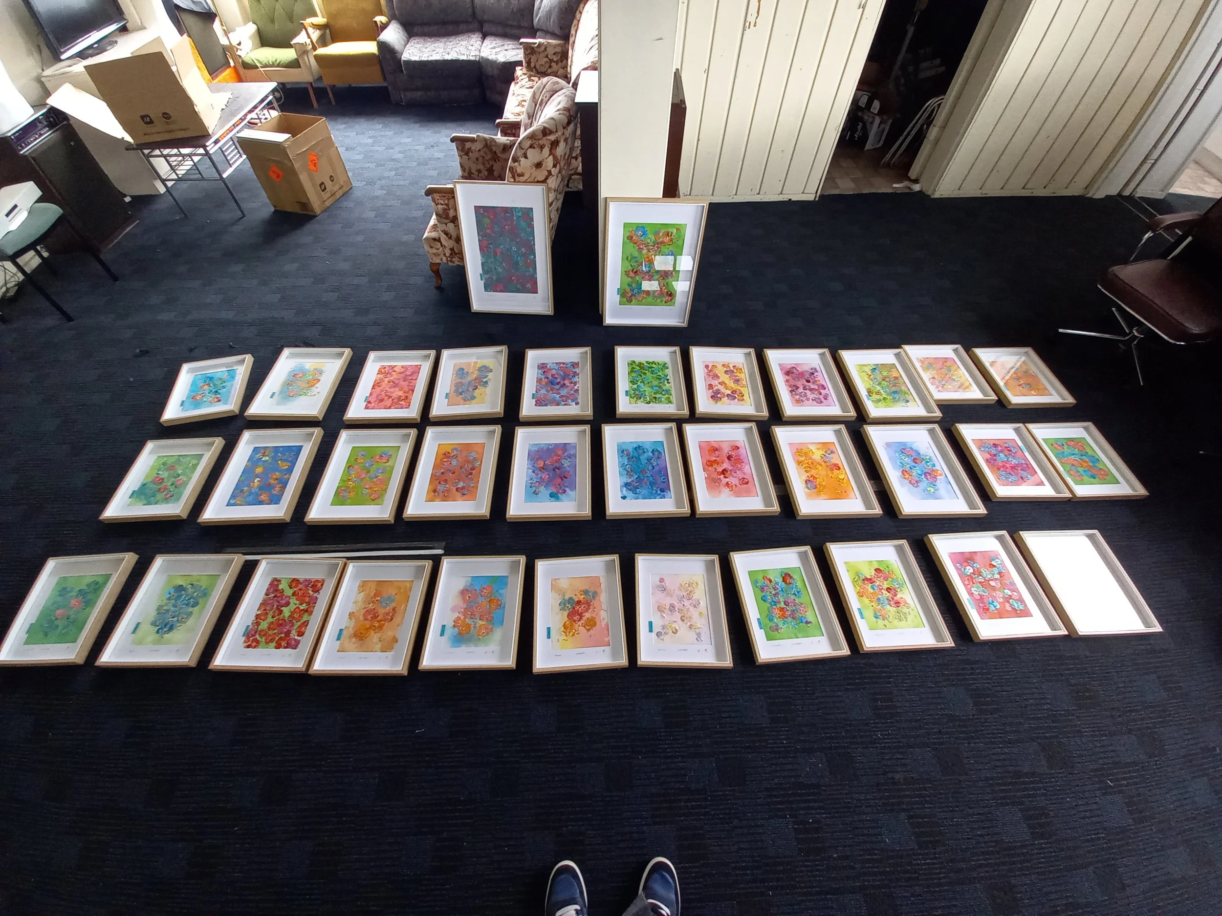
Every once in a long while i'l put the works against each other to see whats goin on. usually when i finish a work i frame it an put it out of site until i have to see it again.
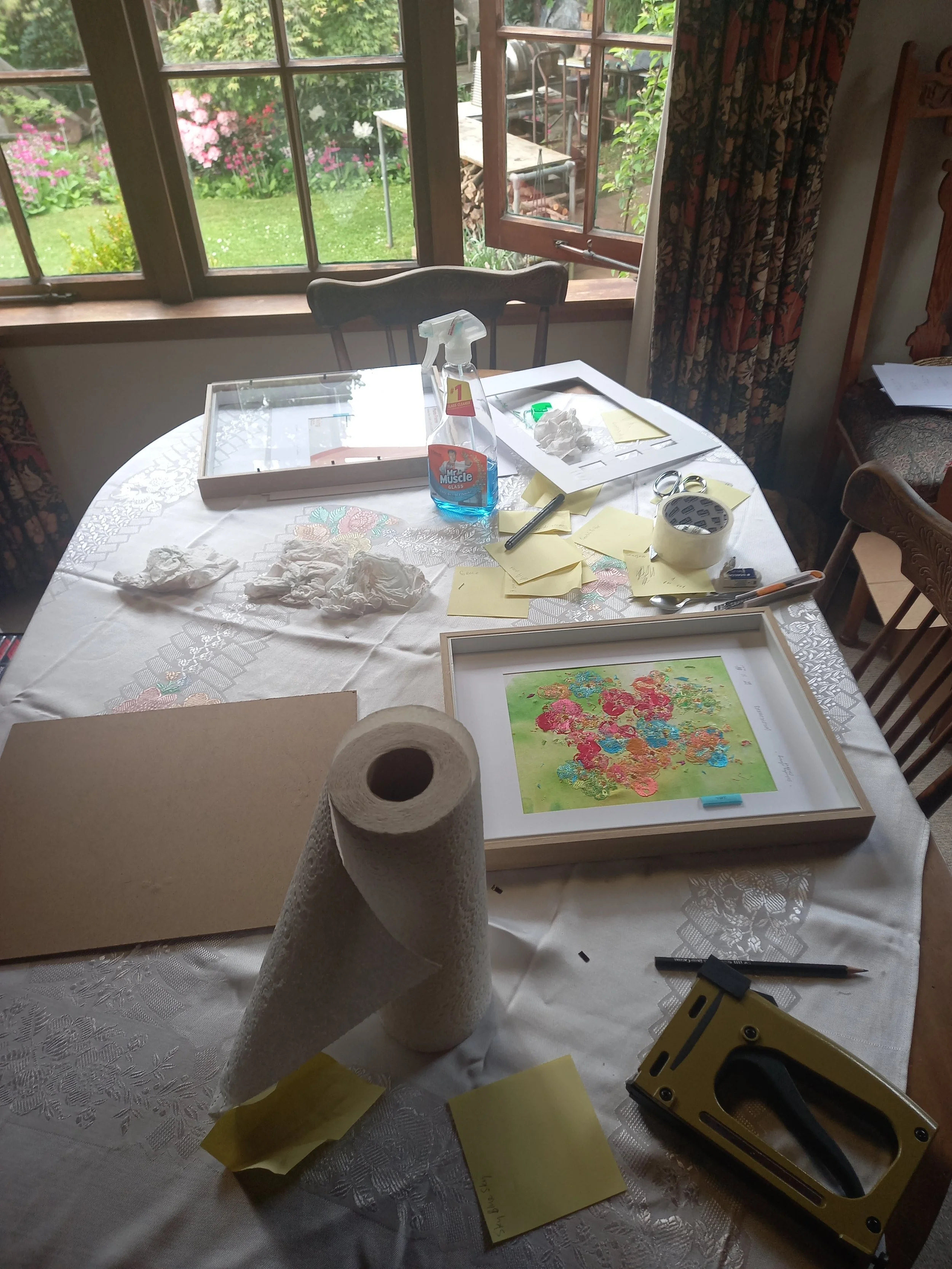
The framing process
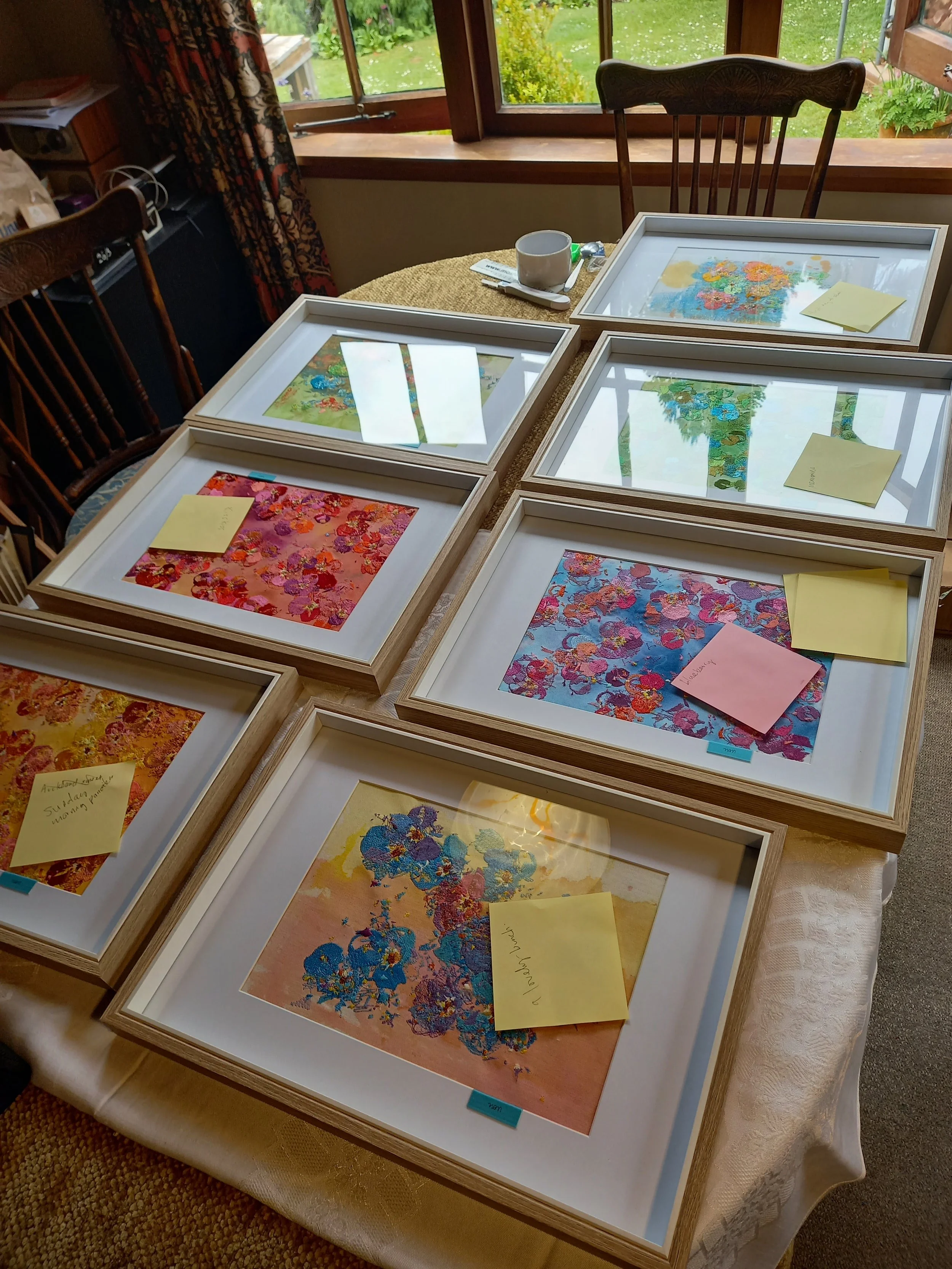
The naming process
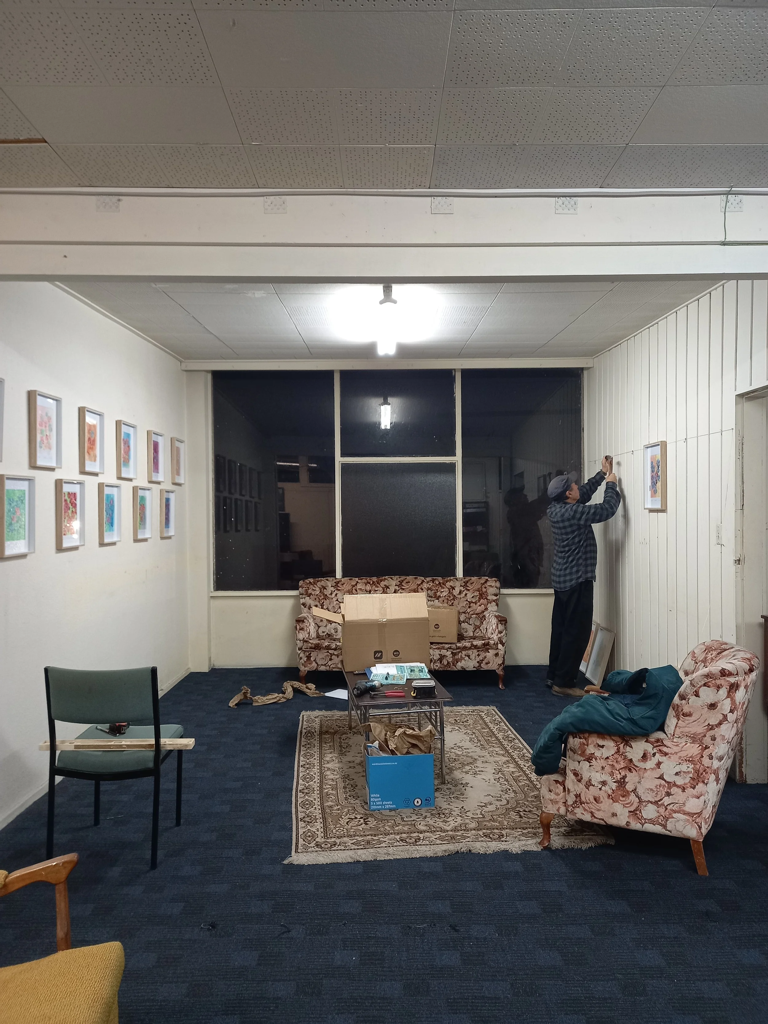
I had a small client only exhibition for Wildflowers in November 2025 at the studio - "First pickings"
Wildflowers class of bloom 3 - December 2025 (works unfinished)
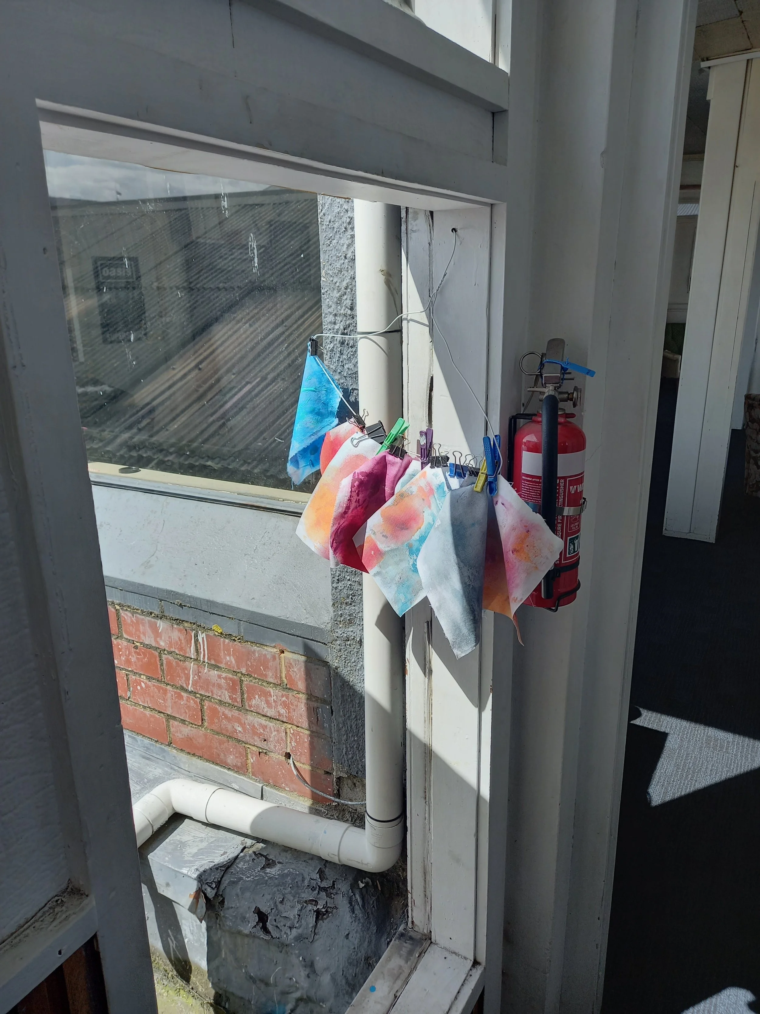
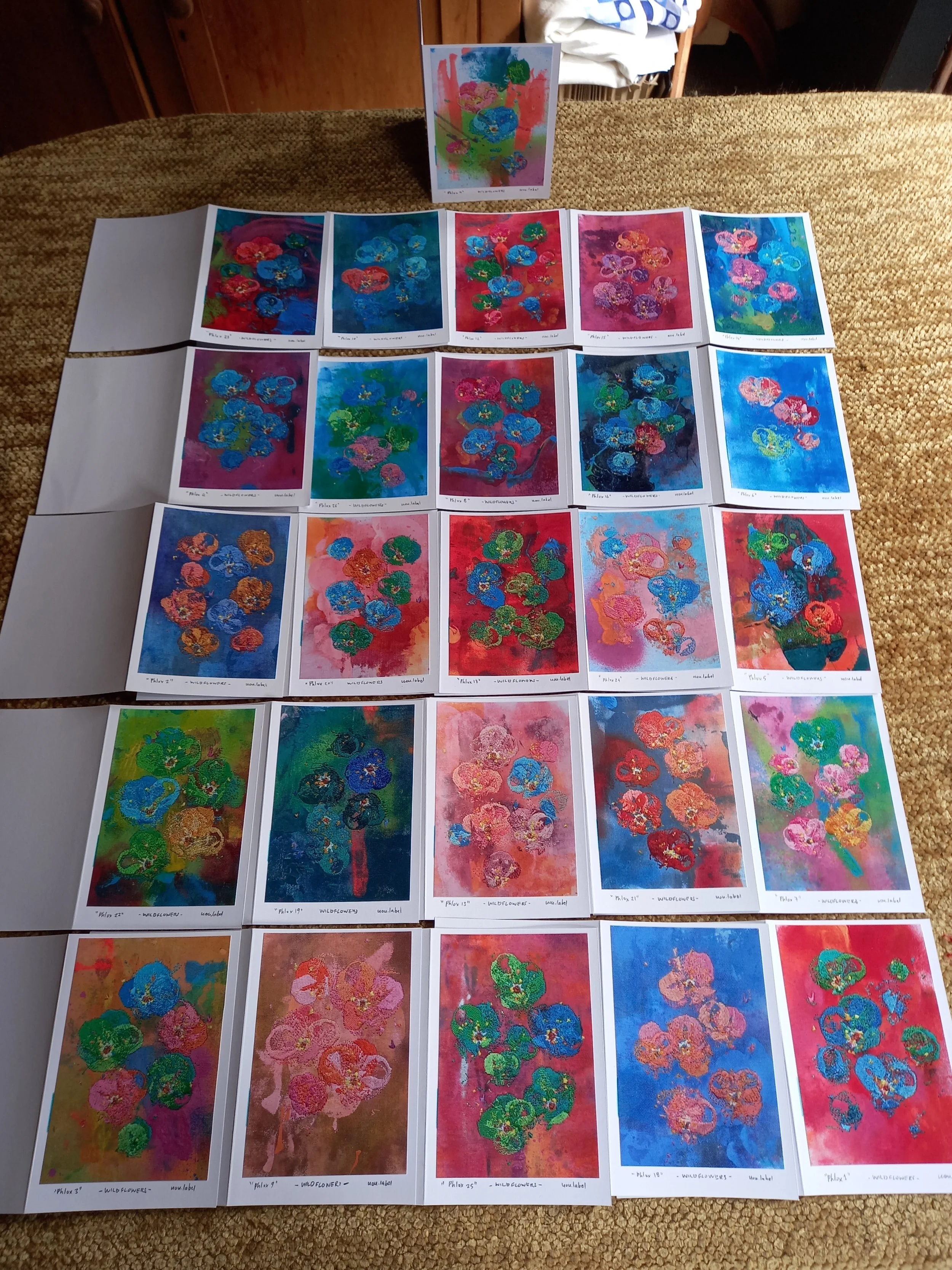
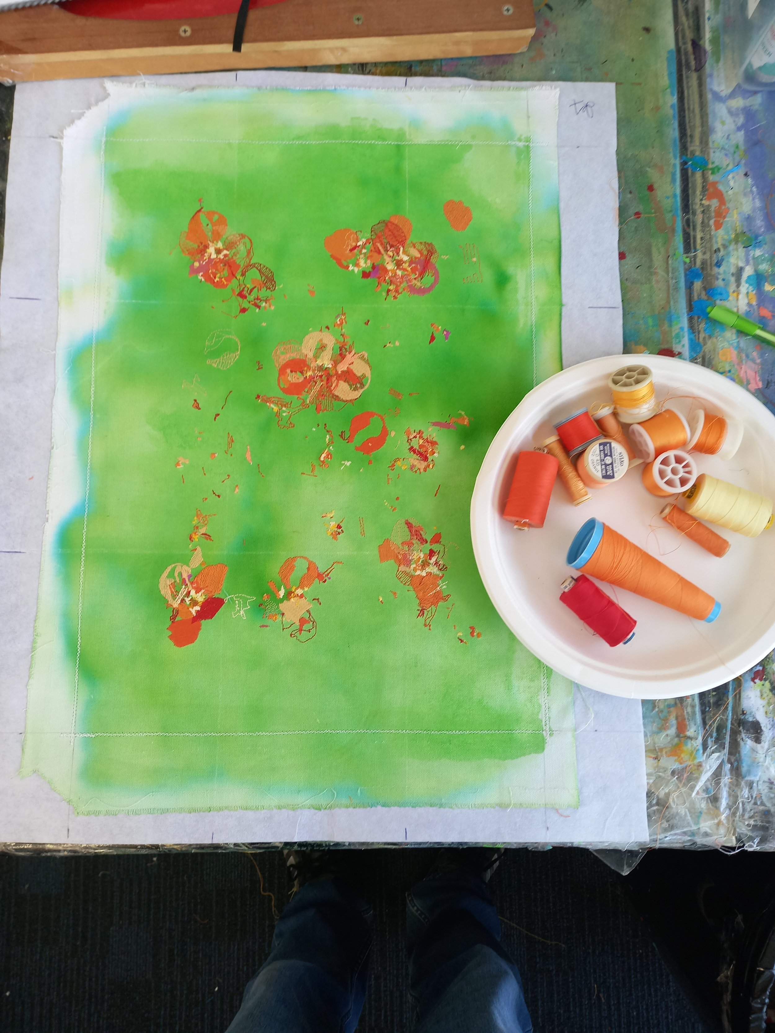
Drying the Flox backgrounds i painted. so much fun creating that wee mini series
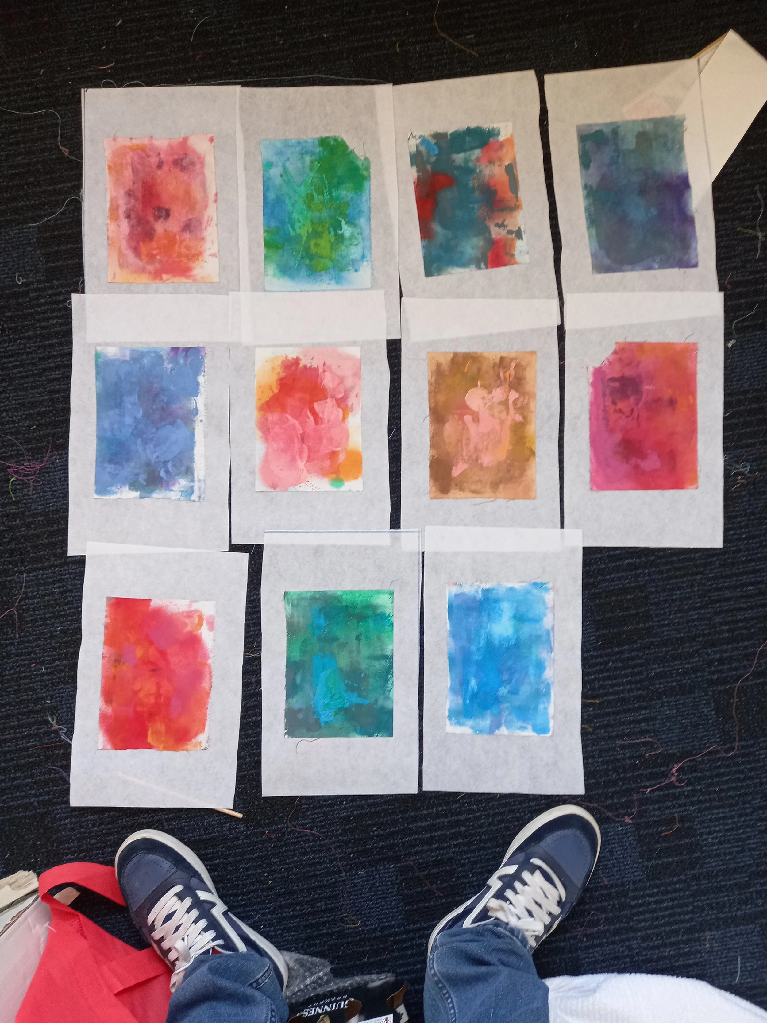
Flox 1 - 11
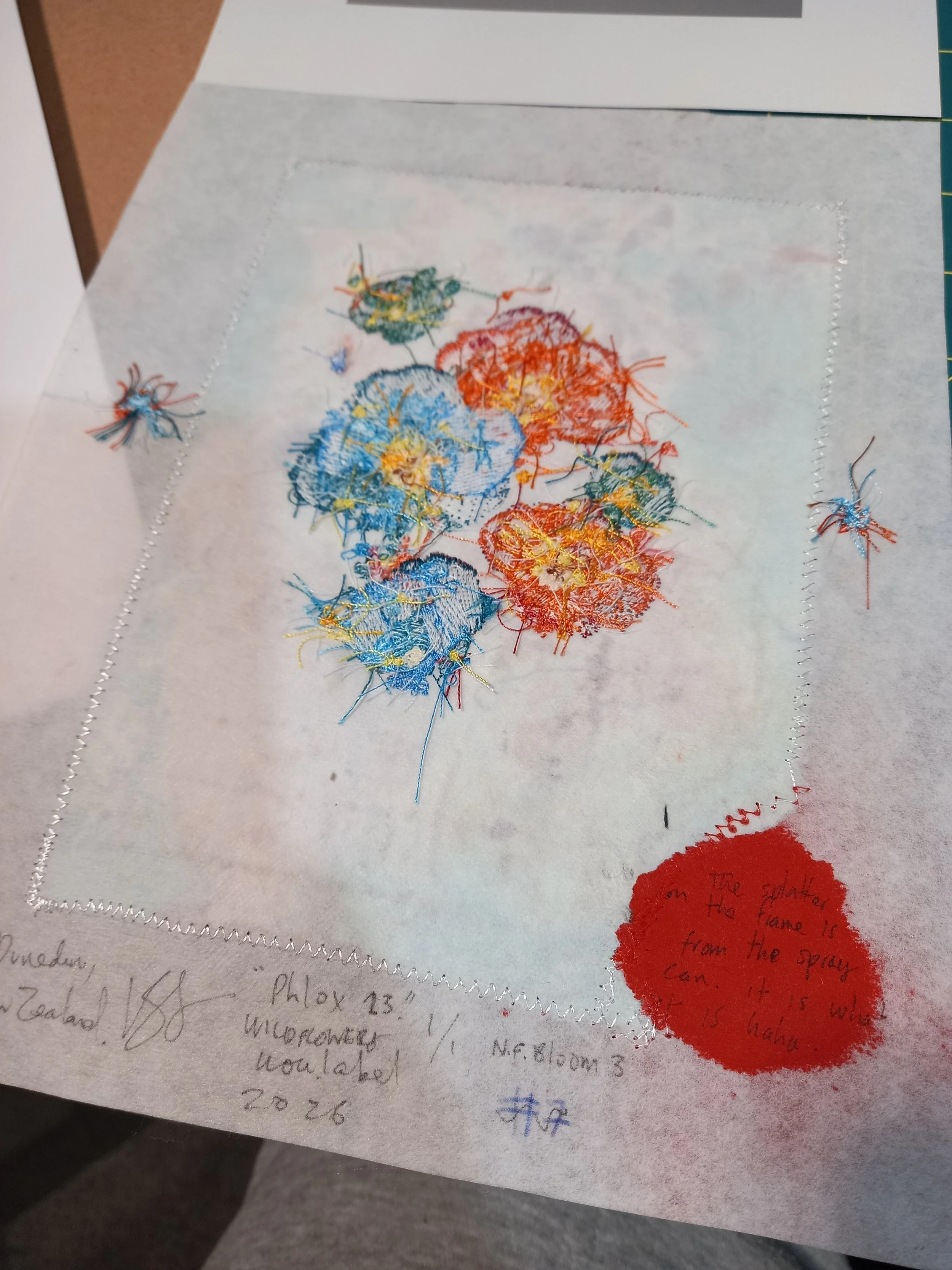
I always sign the back of my works like this. sometimes i'll include random tid-bits
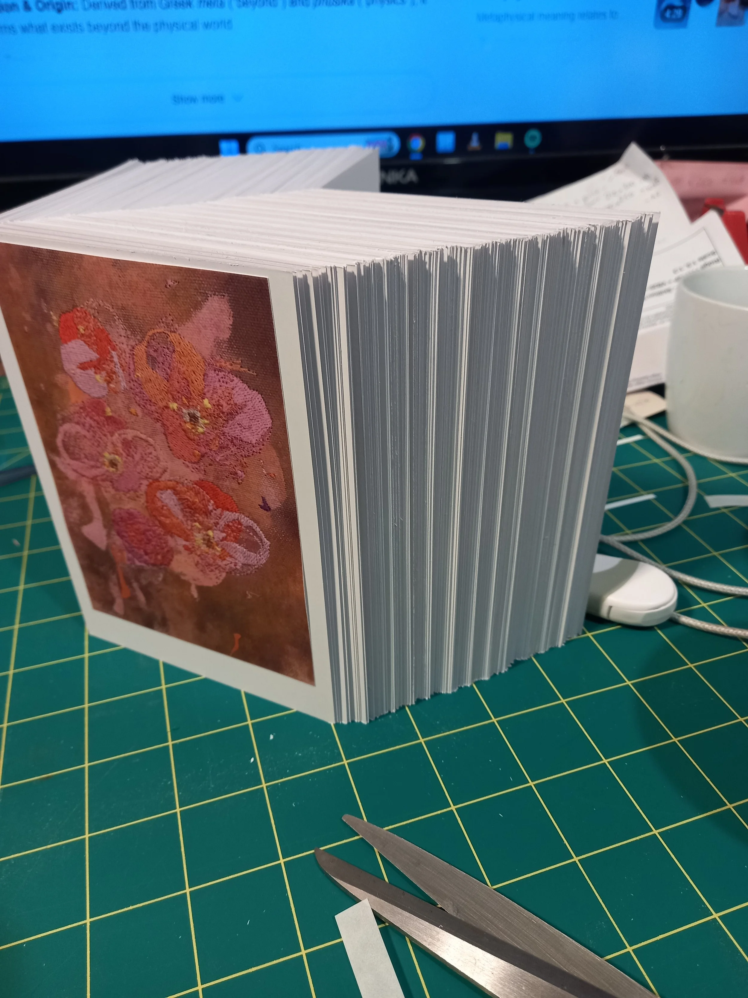
I made a bunch of Phlox cards to give away at the exhibition to further the concept of Wildflowers. they need to spread right?
180+ cards
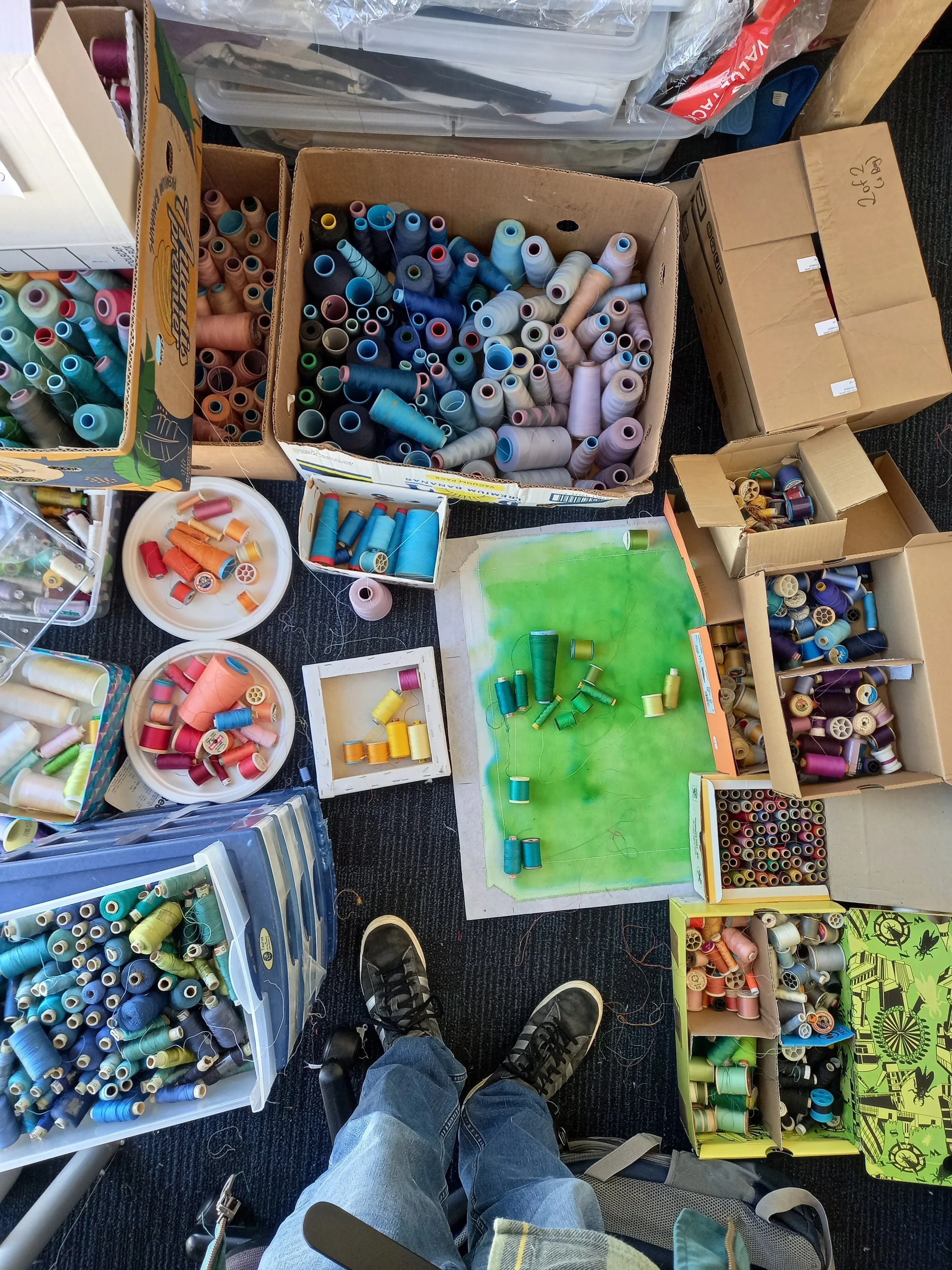
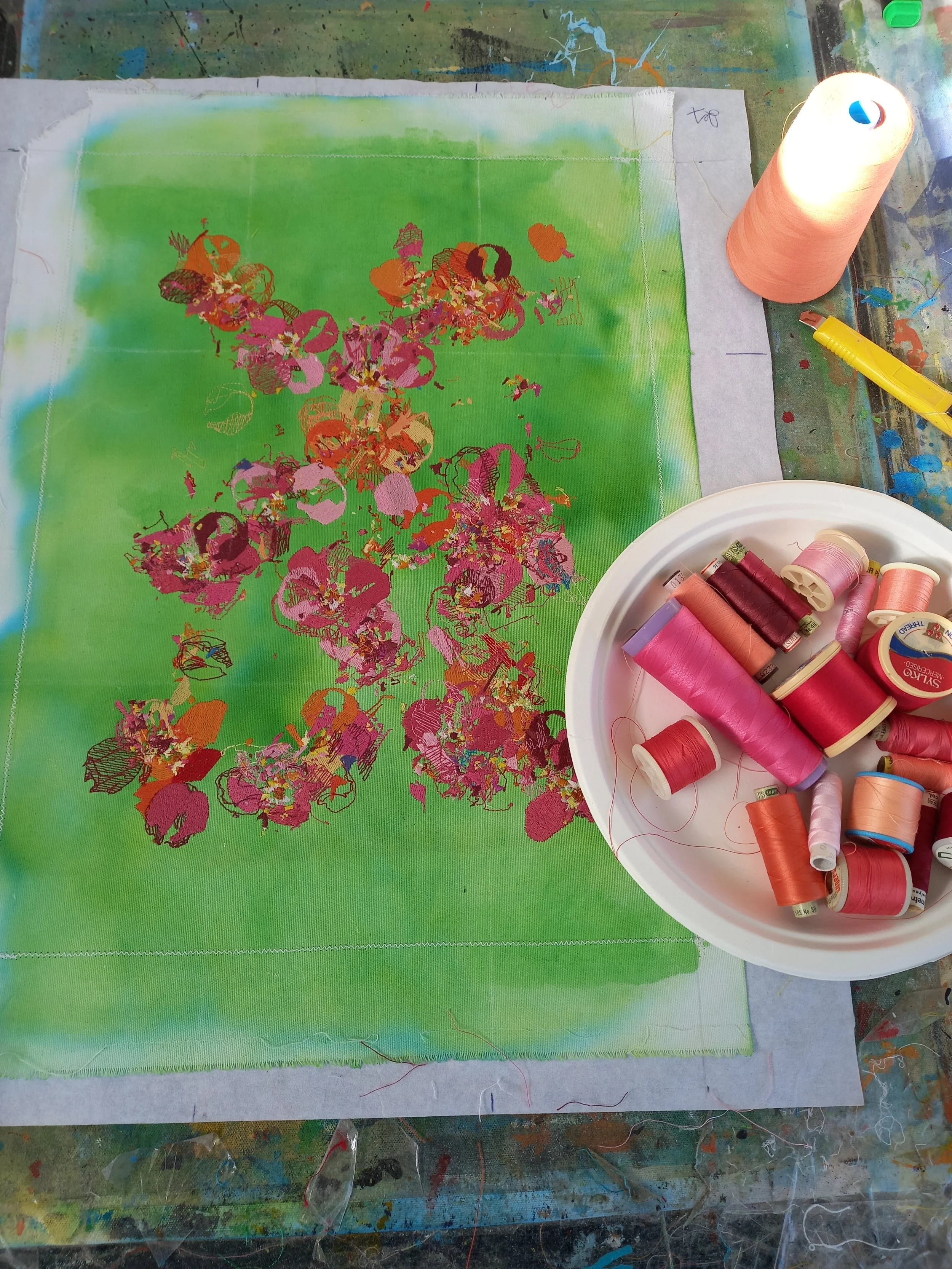
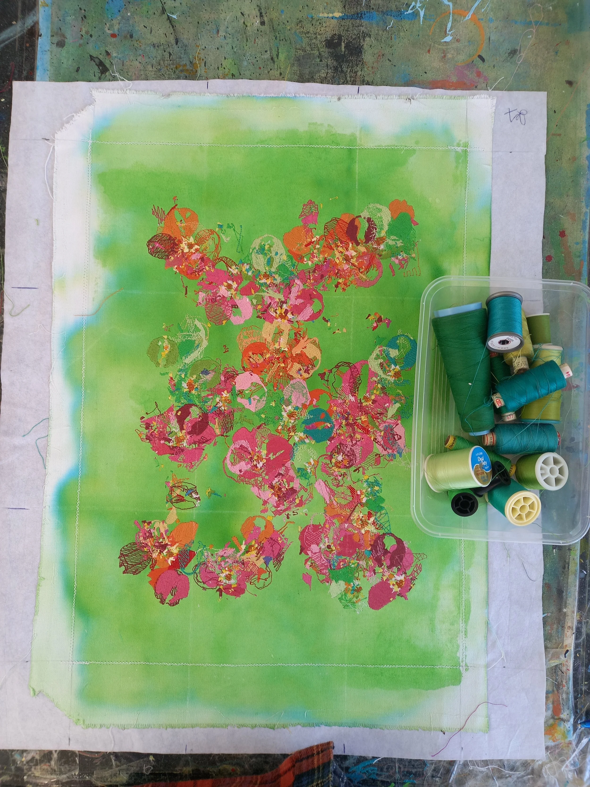
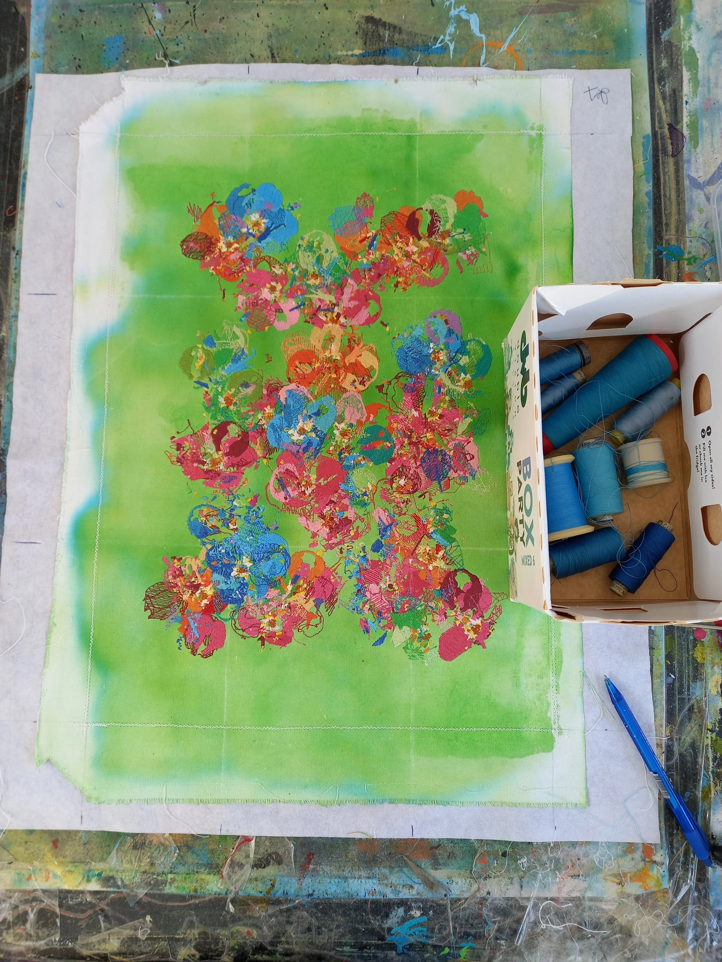
Behind the scenes of making the Phlox works. slightly chaotic but they needed the energy
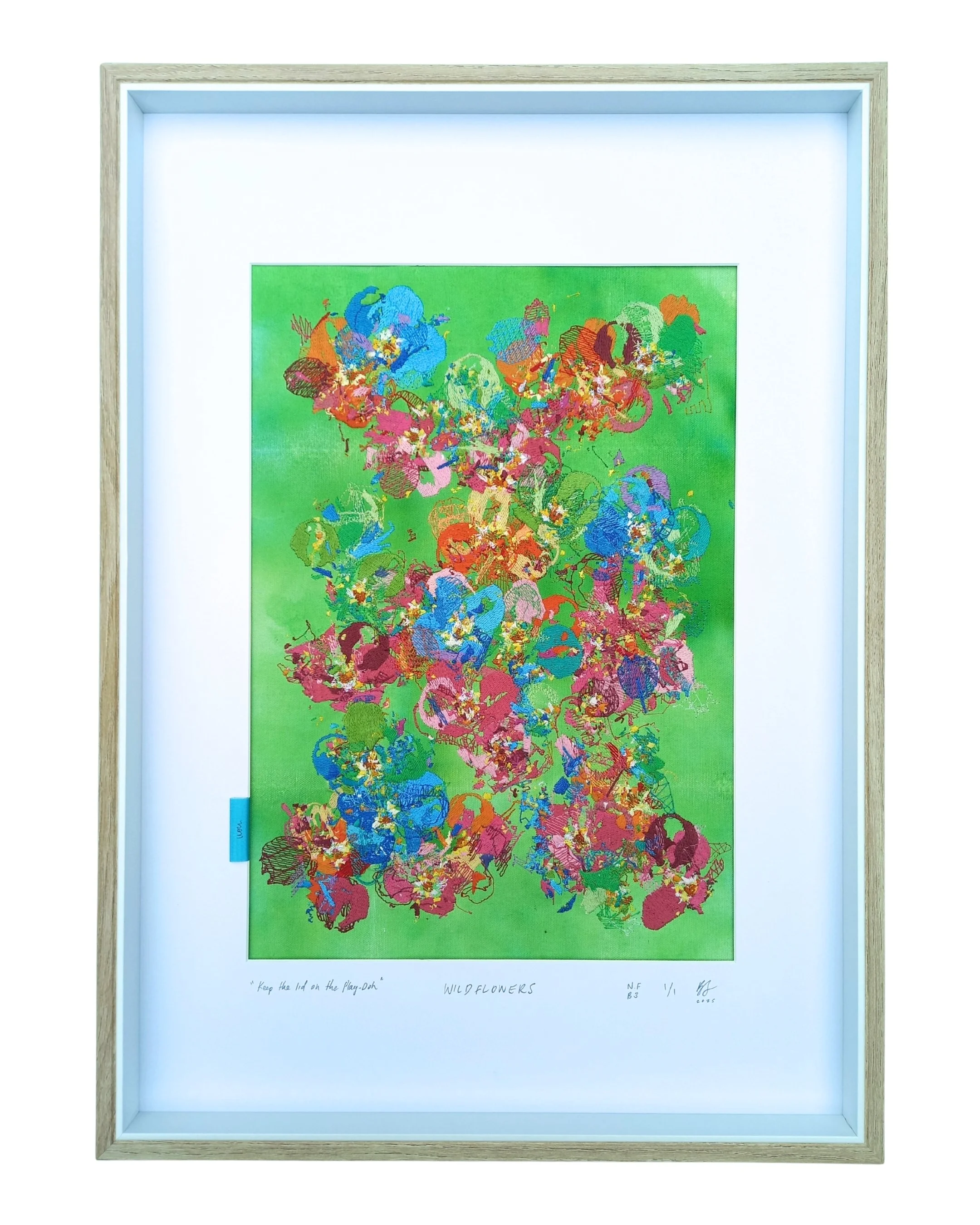
The making of “Always keep the lid on the Play-Doh” - the matte colours of the thread, an just the general chaos of it reminded me of Play-Doh, the reason i titled it “Always keep the lid on the Play-Doh” is a reminder to always try to explore. I very rarely know what colours i’m going to use, i try to do this as if im painting on the fly. if you leave the pottle of Play-Doh open it gets dried,an you cant use it anymore. it’s also just a good classic reminder, shits expensive.
A Playlist of a couple of tracks I listened to, either in the studio or whilst framing. for such a potentially chaotic series it still really had a nice chill soft music feel to it.
A wee walkthough i made for some online clients from the wildflowers First Pickings show (November 2025). I go into a little detail on the works and you can see how they interact with the light.